Redesigning the PeopleGrove opportunity search experience
- Role
- UX Designer
- Solo
- Context
- WGU BSUXD capstone
- Partnered with PeopleGrove
- Deliverables
- Persona, empathy map, journey map
- Wireframes to final screens
Overview
PeopleGrove’s Experiential Learning platform is how WGU students find internships, scholarships, and other career opportunities in their field. The goal of this redesign was to rebuild its mobile search and discovery experience around what students actually do when they’re looking for an opportunity, not around what the platform assumed they’d need.
The current experience
Before redesigning anything, here’s what the Experiential Learning platform looks like today — a desktop web tool, with no dedicated mobile experience of its own.
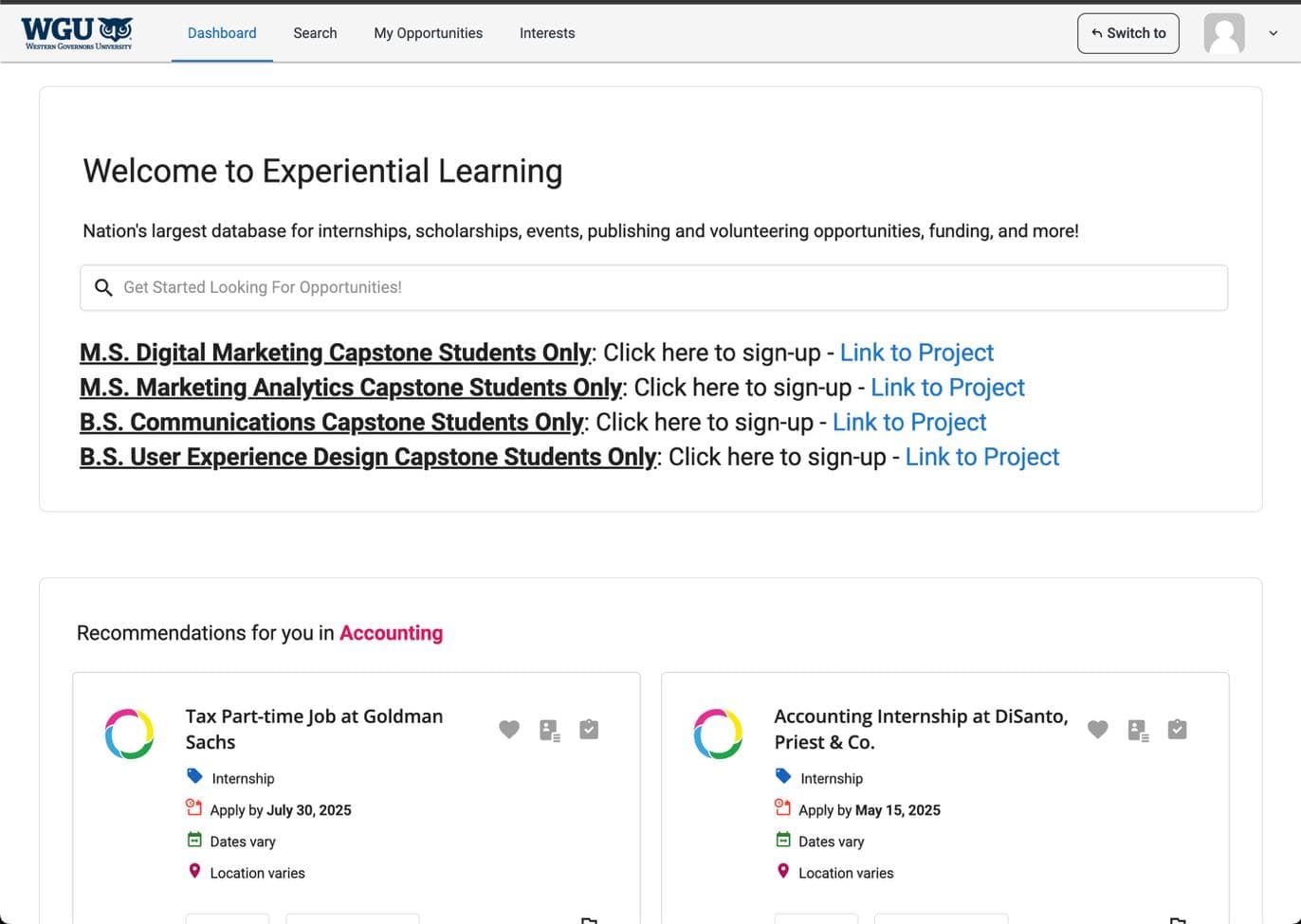
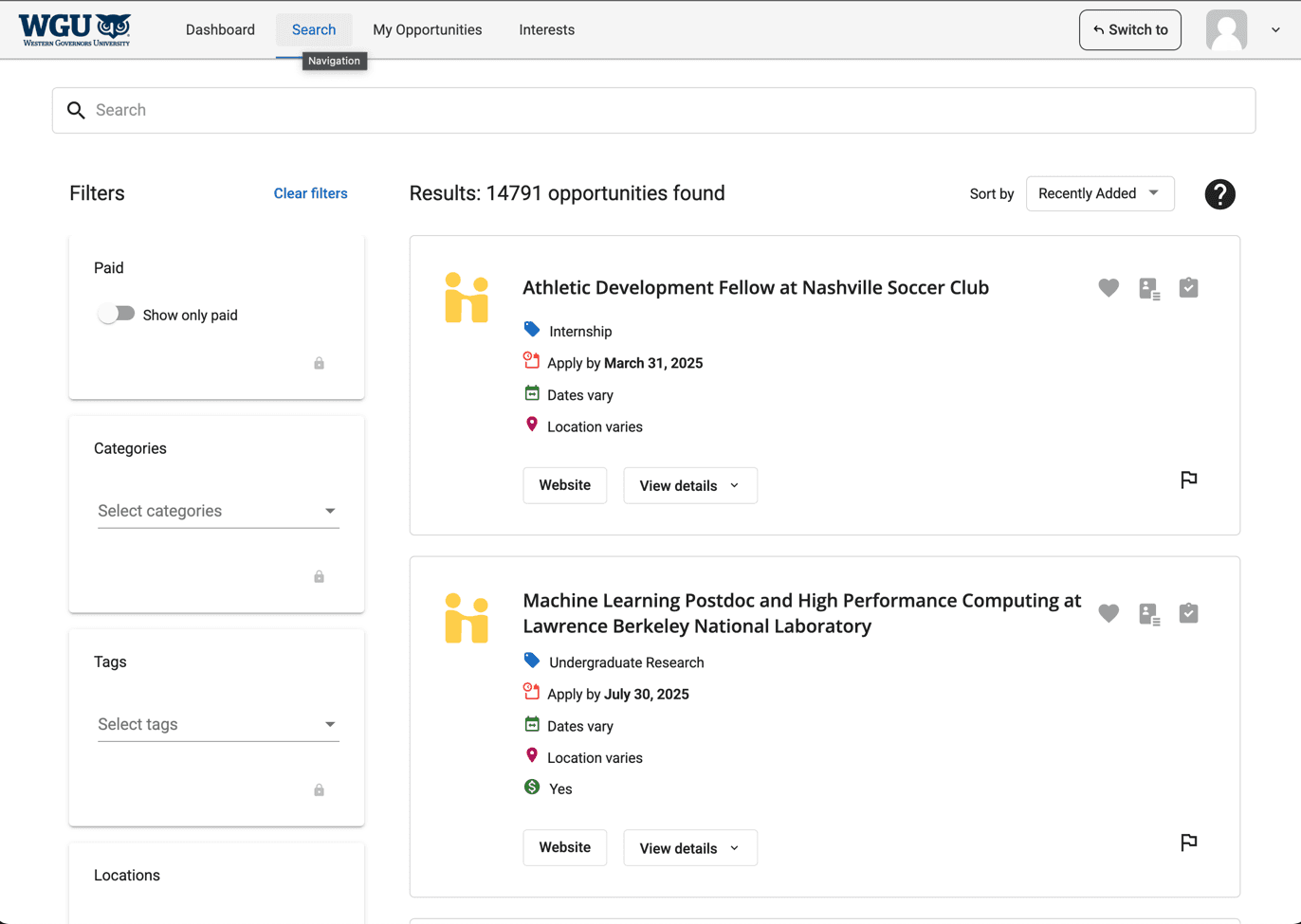
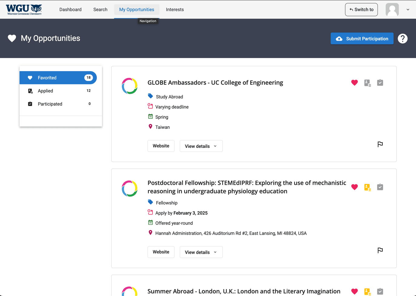
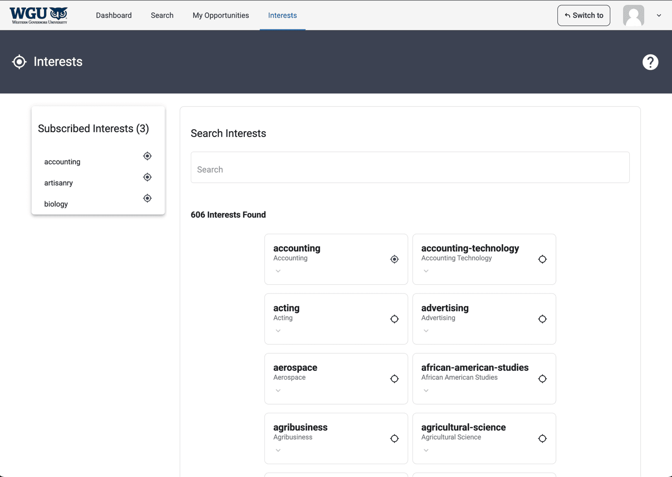
So we went and listened to the people actually using it.
Research synthesis
“The layout is too minimalist — not enough filter options.”
Meet Fiona
Built from interviews with 4 WGU students about their goals, expectations, and frustrations using the platform.


Fiona Hill
The Time-Pressed Applicant
- 21
- College Student
- Pittsburgh, PA
Bio
Current college student actively looking for internships or entry-level opportunities in her field. Familiar with similar platforms (LinkedIn, Indeed, Handshake, Glassdoor), but this is her first time on this one. She’s used tools like it before, so she’s not intimidated. She gets the concept immediately, but how confident she feels using it well depends on how clear the layout and filters are.
Personality
Fiona
User journey map
Fiona’s journey across four stages — tap one to see her tasks, feelings, and where the experience still falls short.
- Scans the empty dashboard
- Types an interest keyword
- Confirms it was added
Starts neutral and mildly unsure, becomes confident once the interest is confirmed added.
Wasn't sure which job types the interest she picked would actually surface.
Before locking anything in, I put it in front of real users.
Usability testing insights
Two peers walked through wireframes of the Dashboard, Search, Saved, and Interests screens, thinking out loud as they went. Confidence scores landed between 2.5 and 5 out of 5. The dip wasn’t about understanding what the platform does. It came down to how clear the filters and layout felt. A handful of issues kept coming up, and those are what shaped the next round of wireframes — the ones that carried through to the final screens ahead.
A mobile experience built for discovery, clarity, and confidence.
What I built
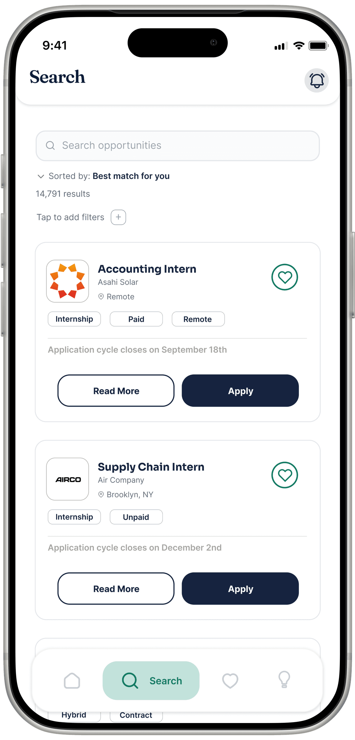
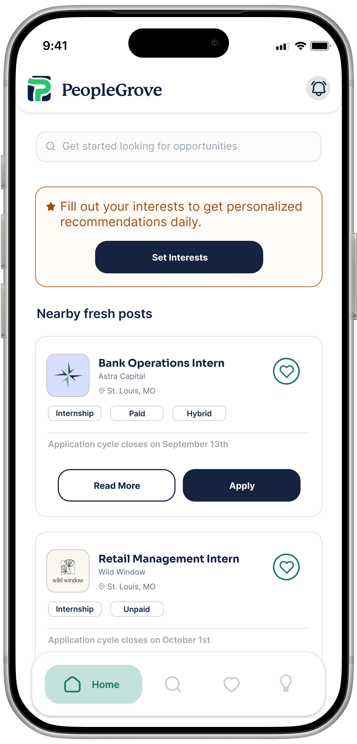
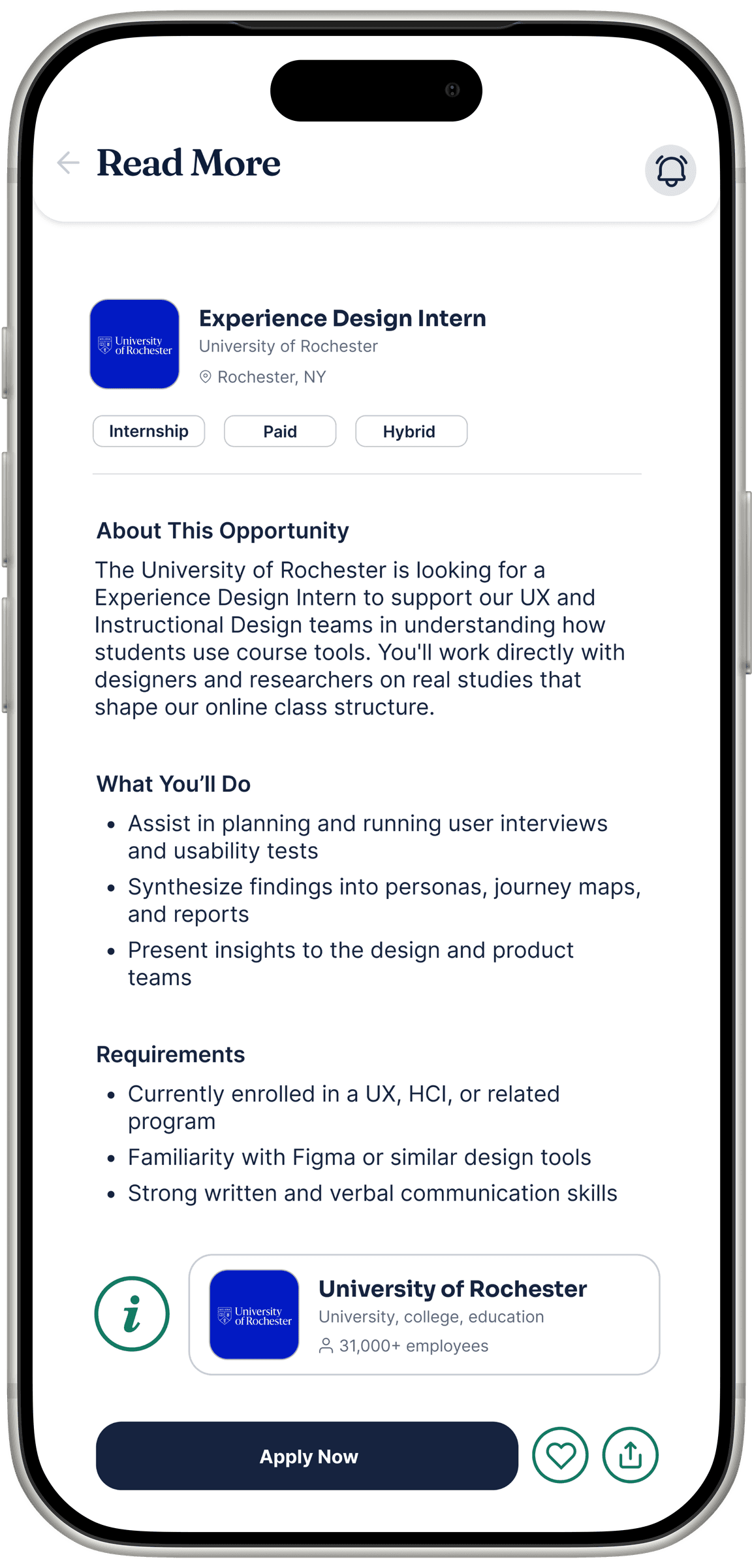
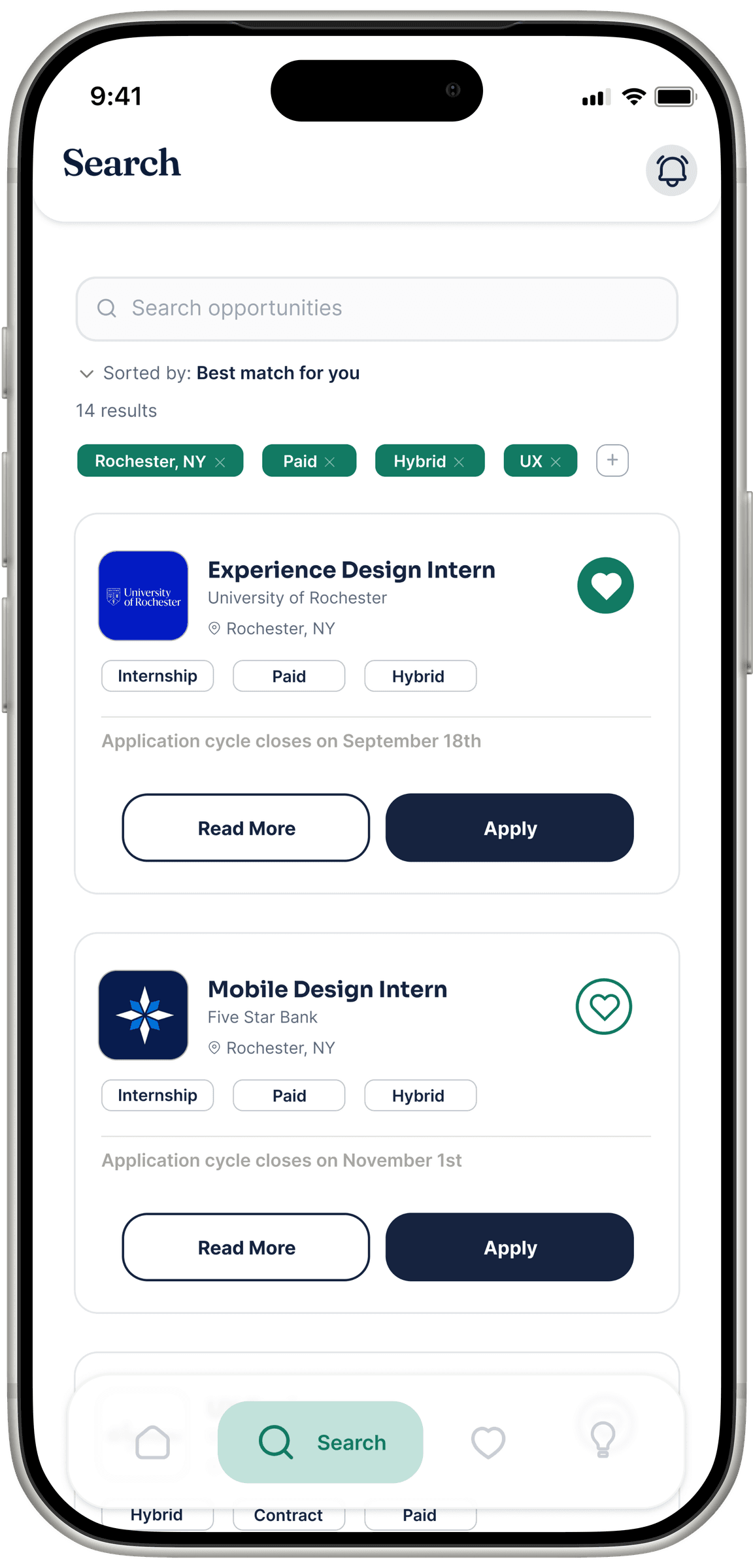
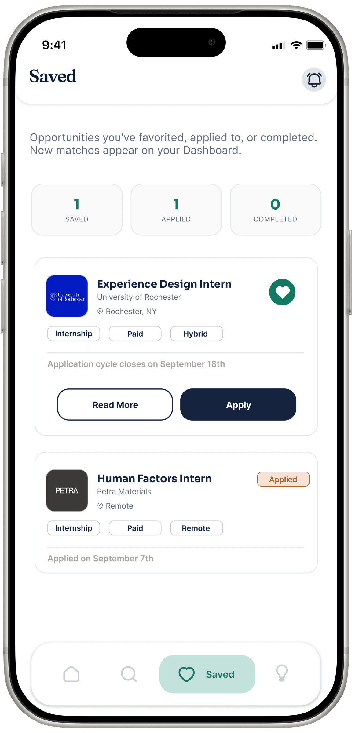
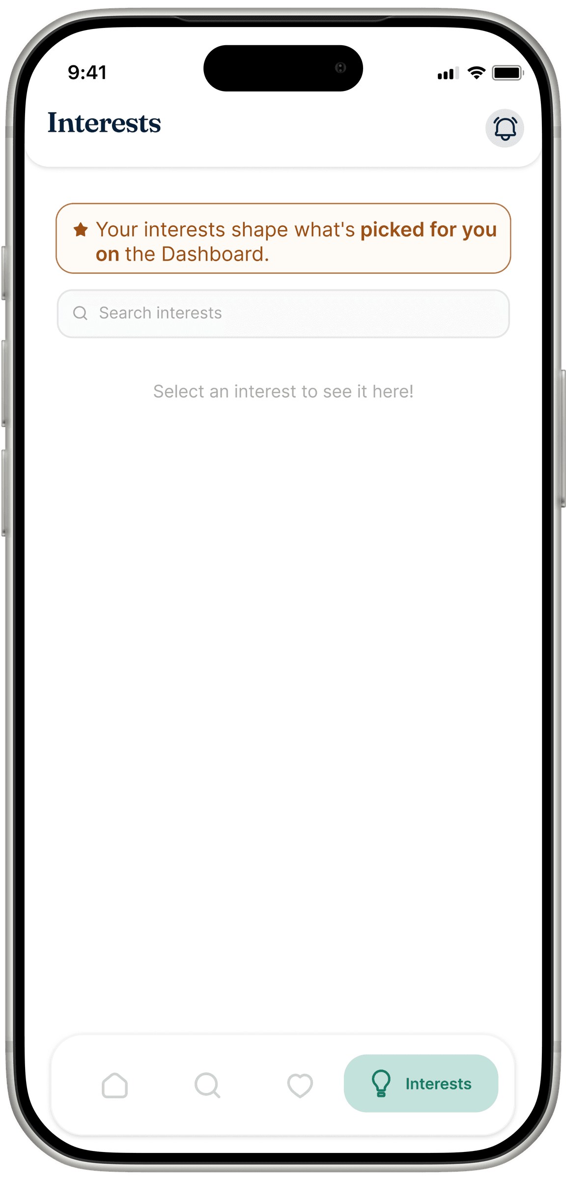
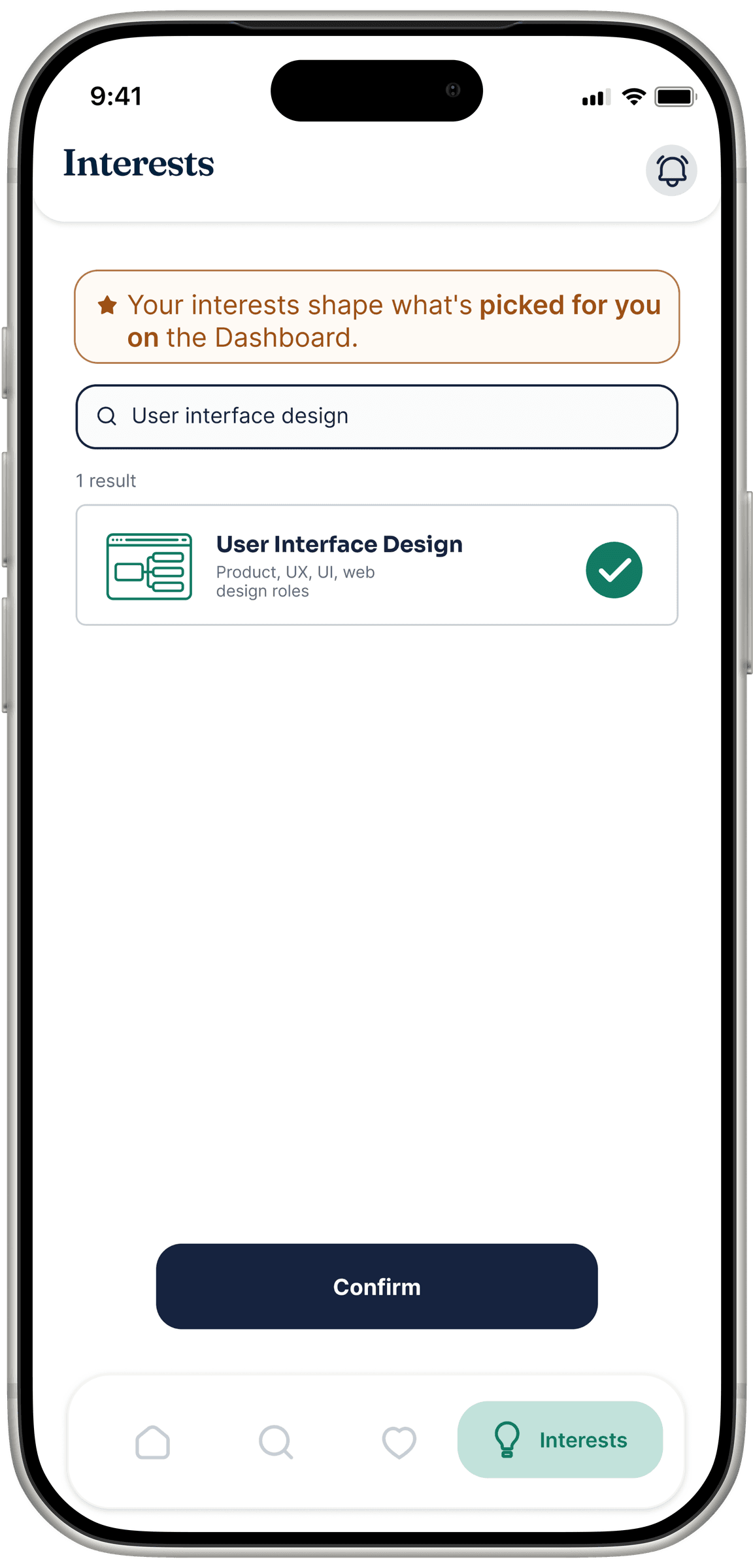
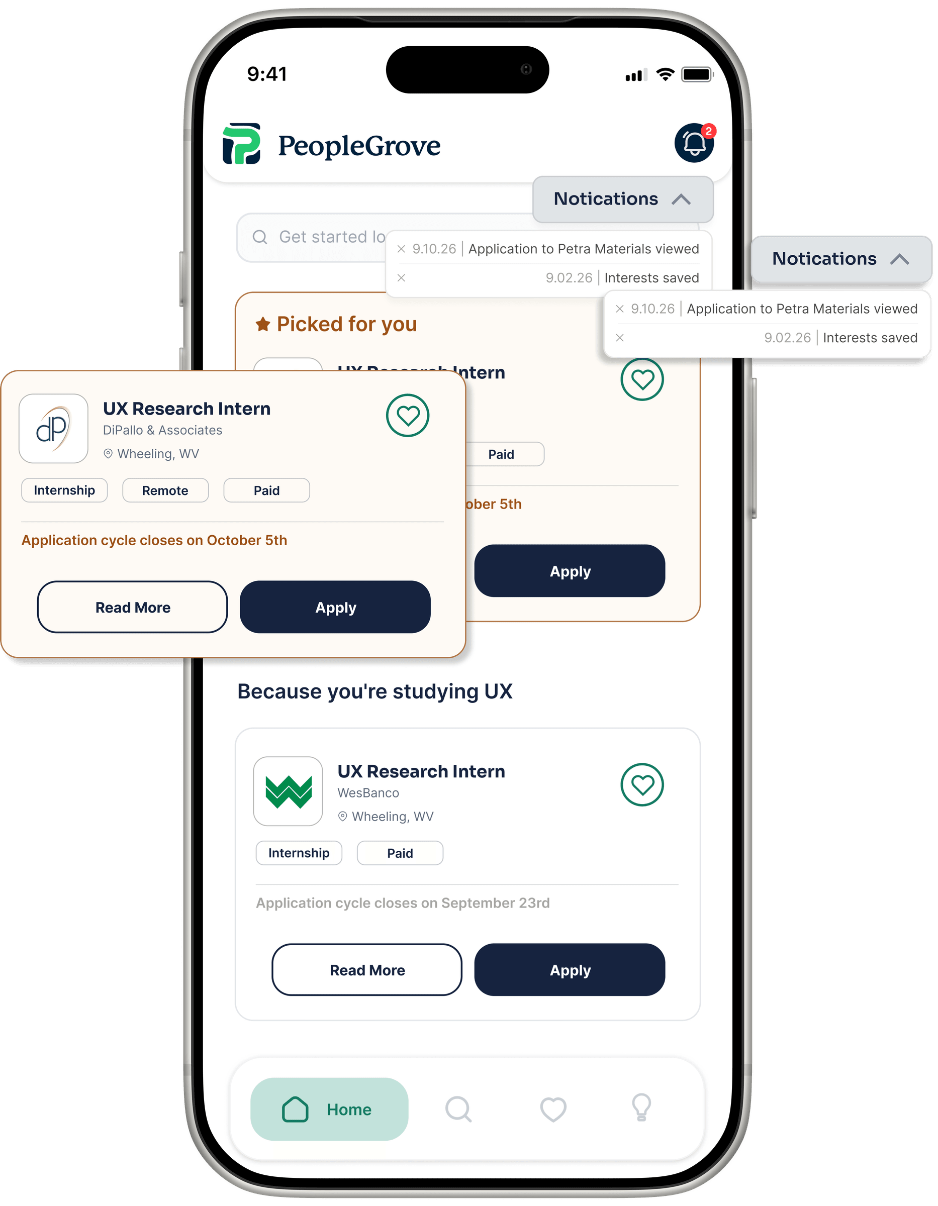
A closer look at the final screens.
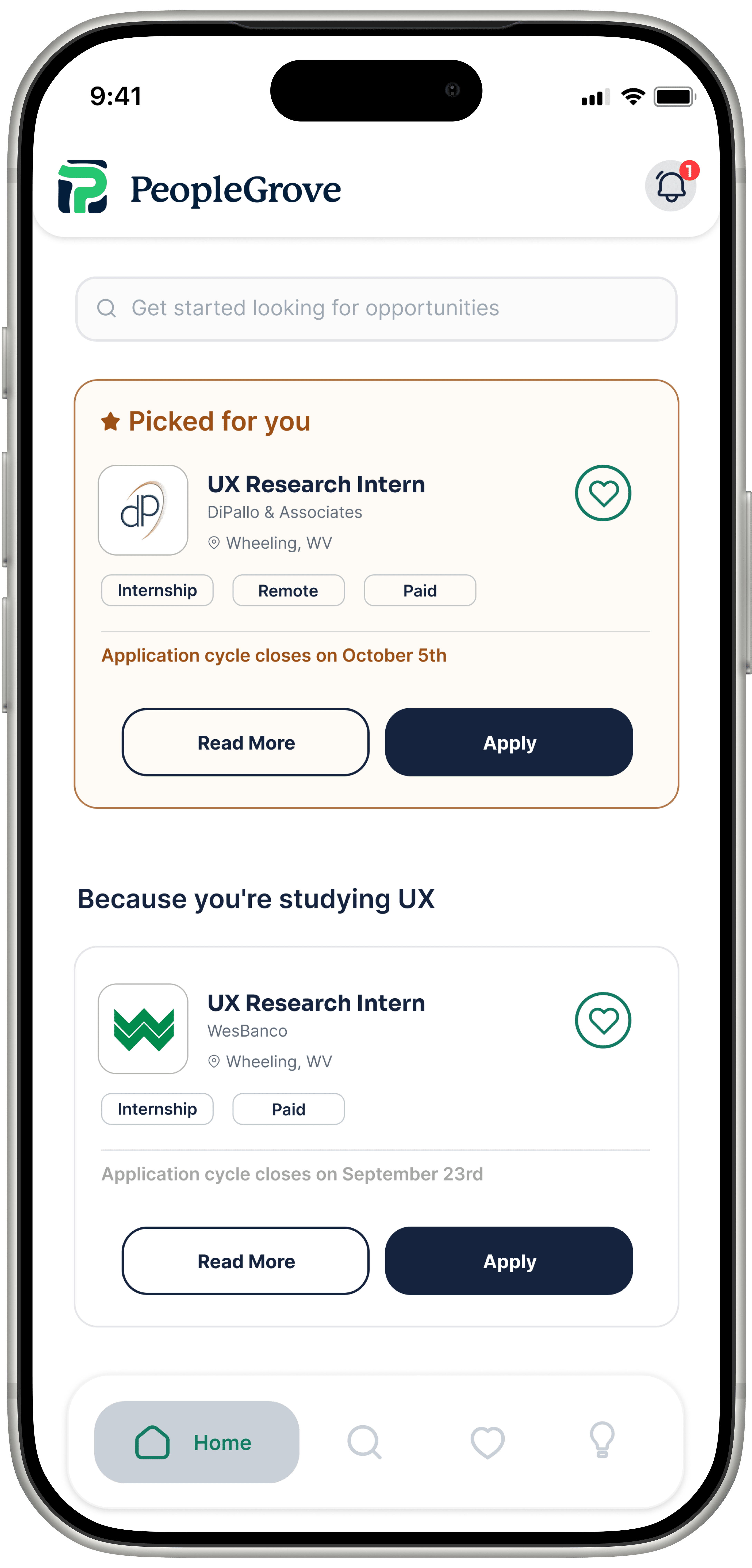
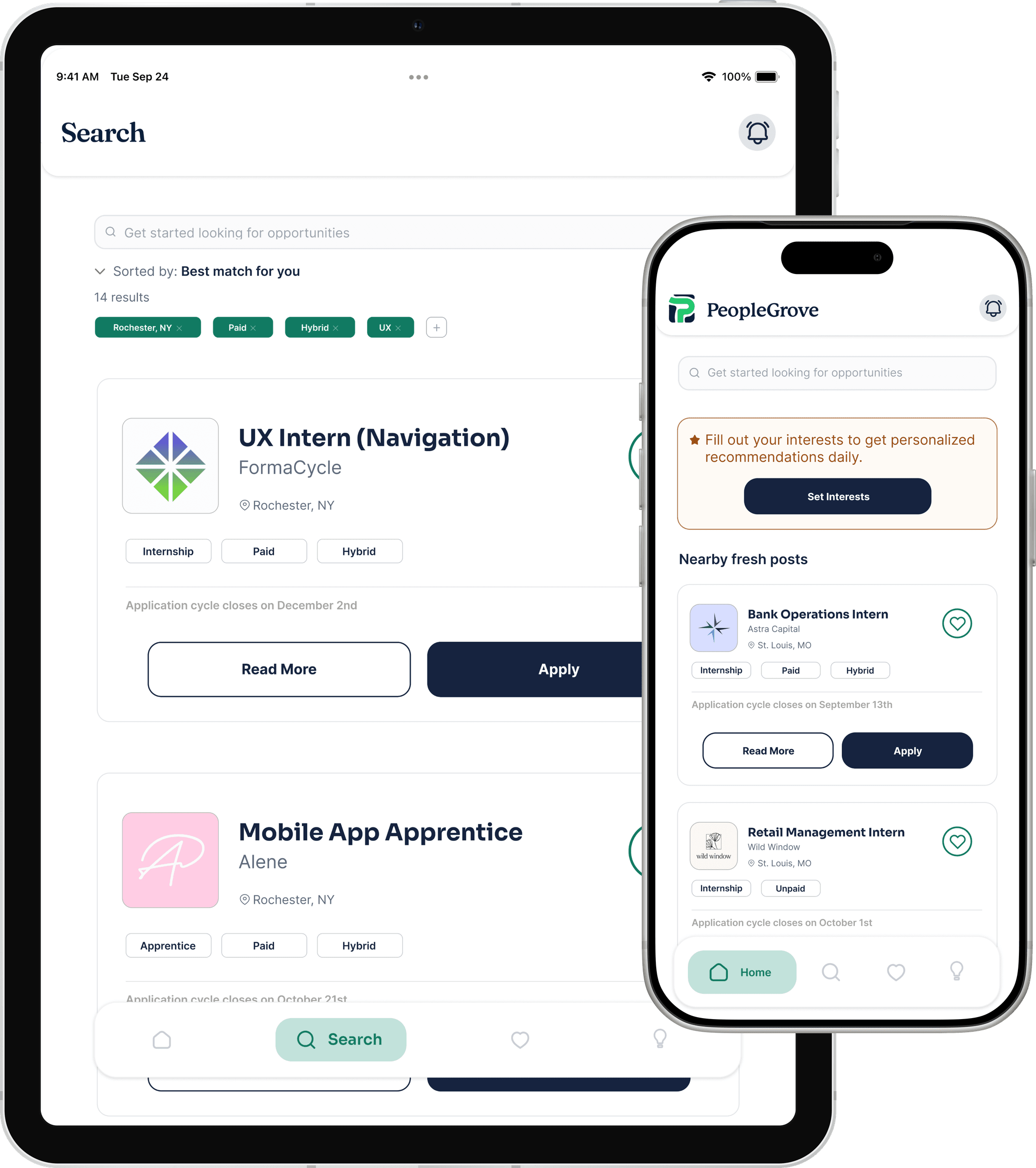
Home
A bordered “Picked for you” card leads the screen, with quick tabs below.
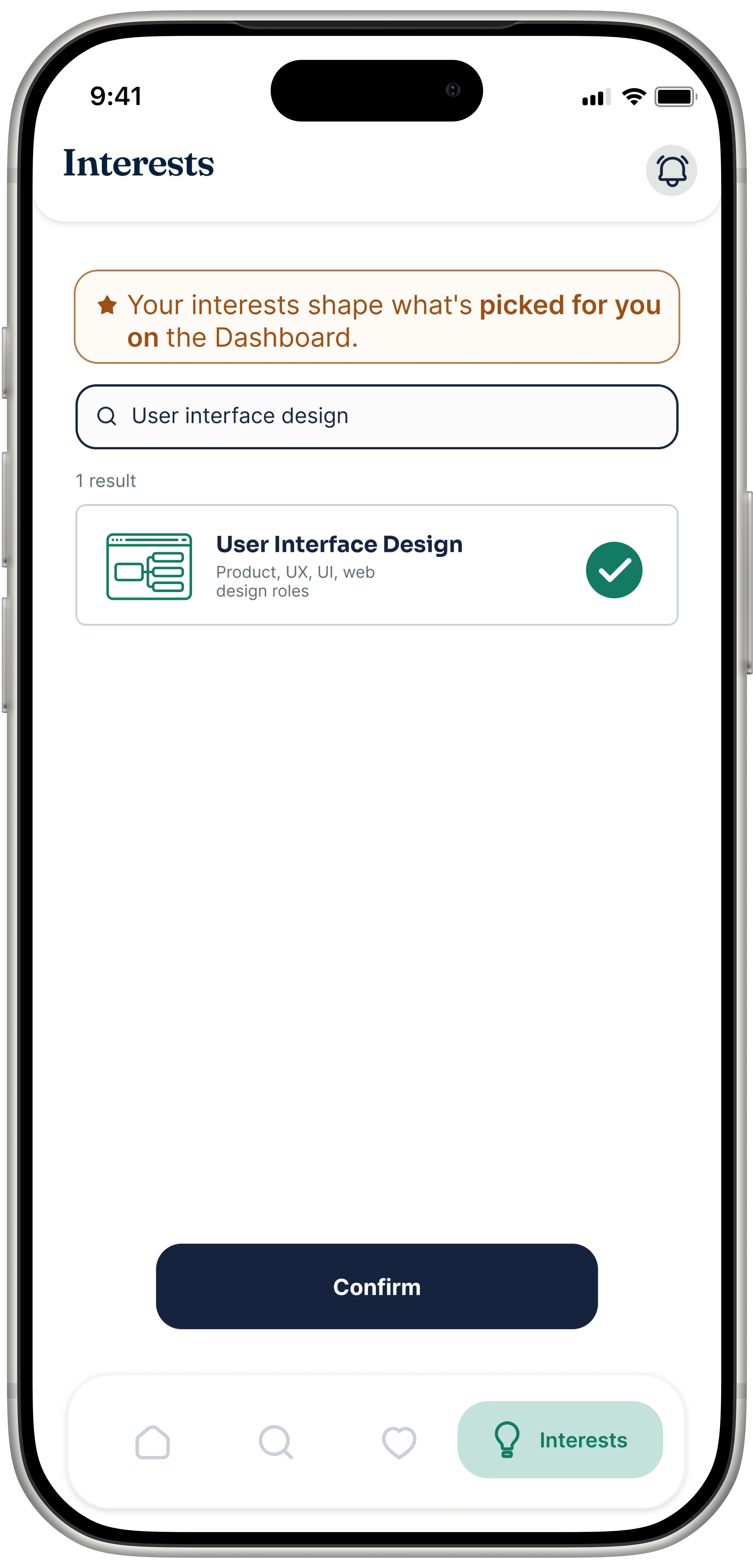
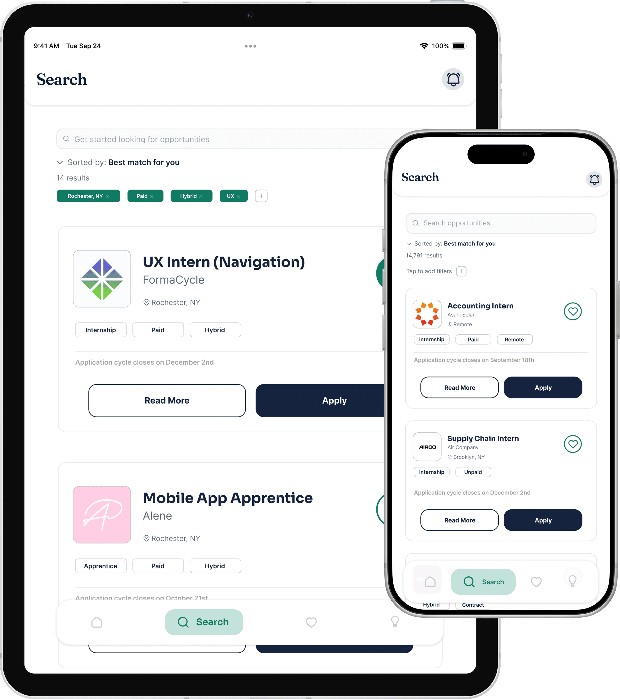
Interests
A searchable list, where each result states which job types it maps to.
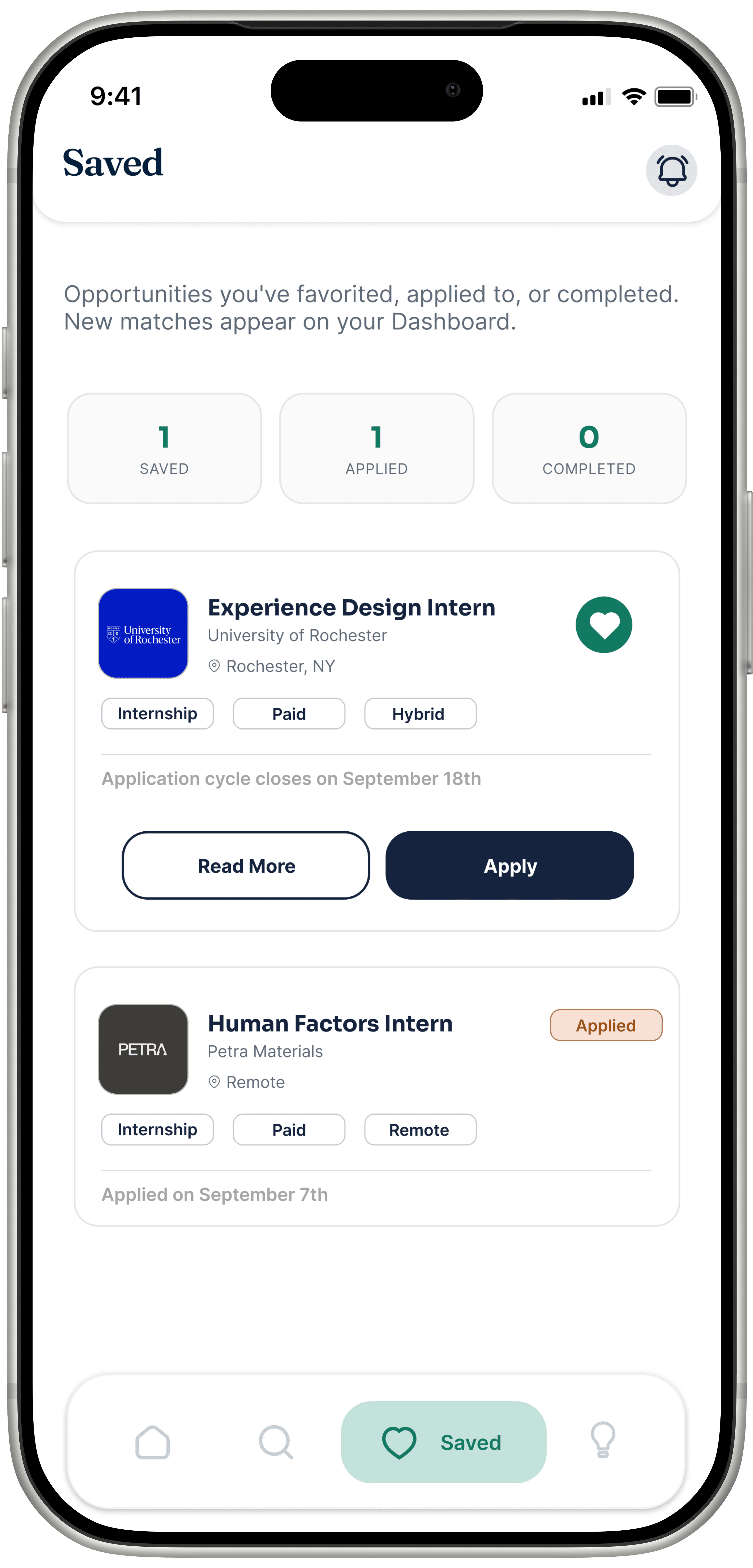
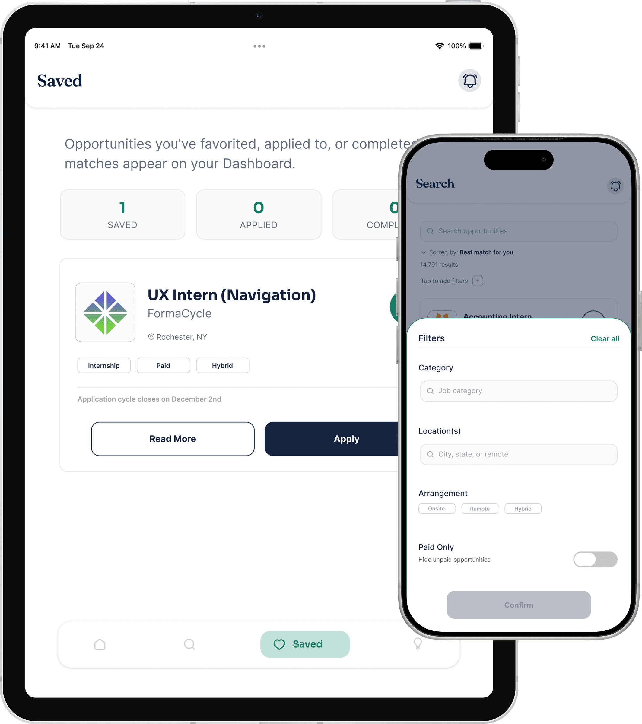
Saved
Saved, Applied, and Completed, shown as three clear counts.
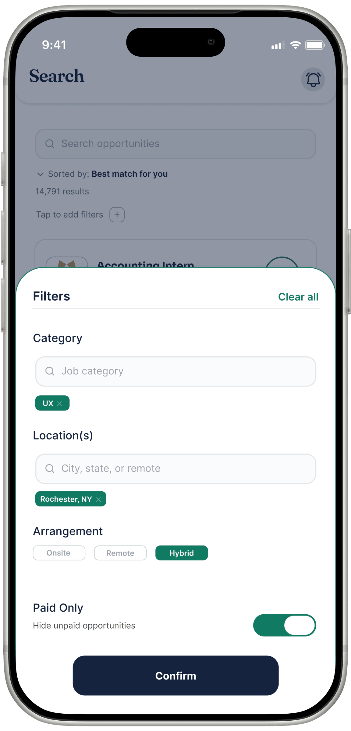
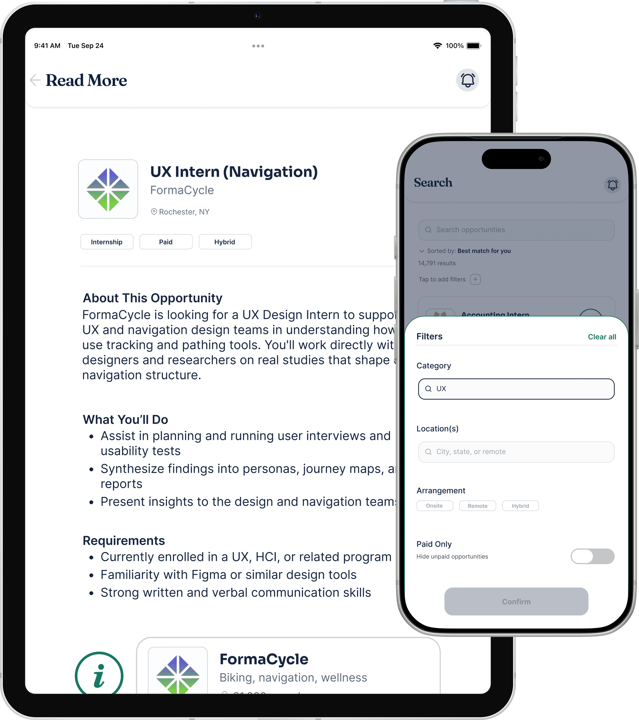
Filters
Category, location, and arrangement, all set in one sheet.
Every decision tied back to something a real student told me.
What worked
Letting usability testing drive the redesign, not just the visual polish. The tap-target split and the filter consolidation were direct responses to what two testers got stuck on.
What I'd do differently
Map every reachable screen before testing starts, not just the primary navigation screens. I scoped my wireframes to four core screens and left out Read More, so it never got the same round of feedback as the rest.
What I'd track
Save-to-apply rate, how often people actually use the filters, and how fast someone finds a job worth applying to.