Revealing what a claim doesn’t tell you
- Role
- UX Designer
- Solo
- Deliverables
- Persona, empathy map, journey map, wireframes to final screens
- Context
- Independent project
- Mobile & desktop app
Overview
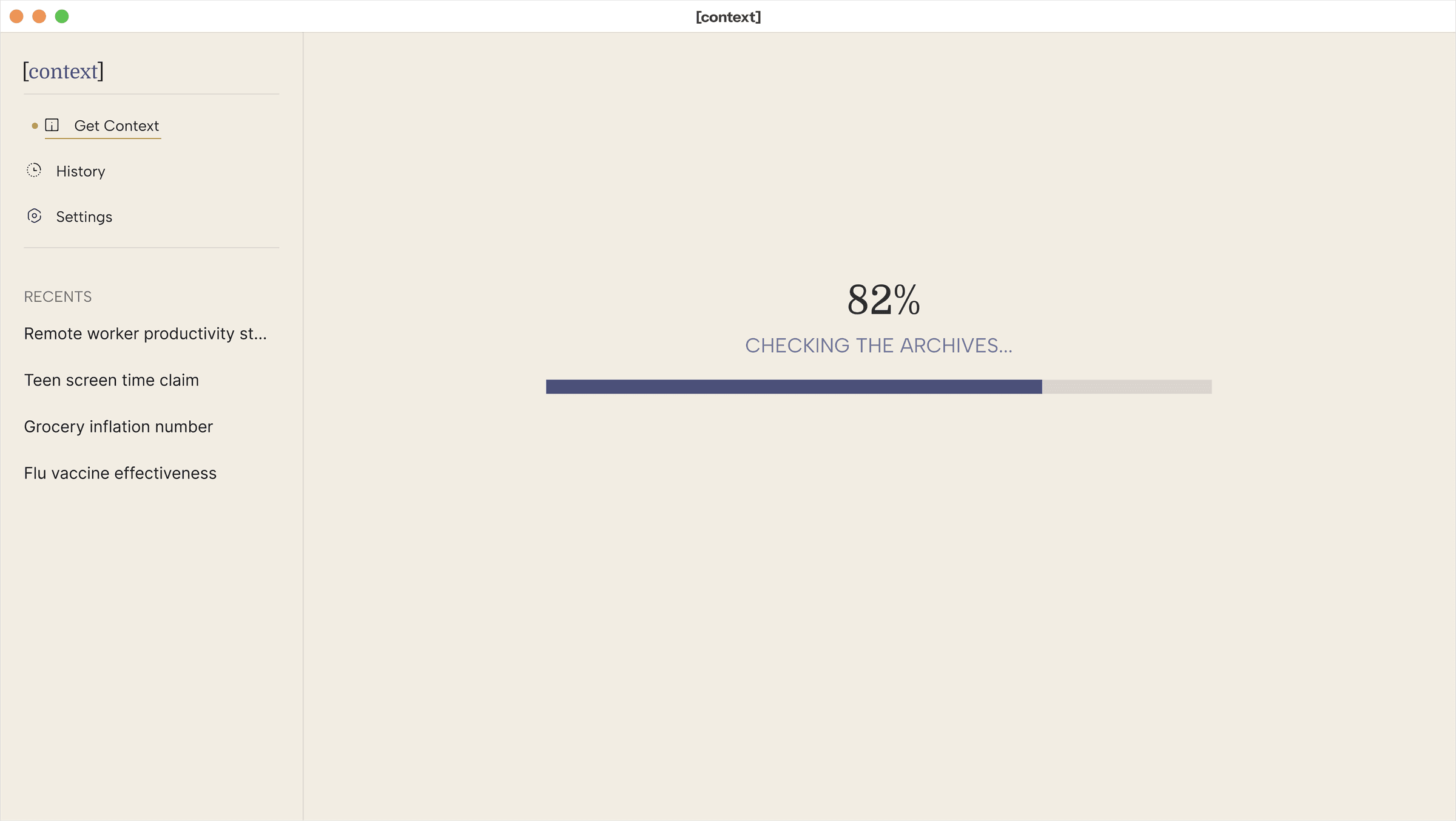
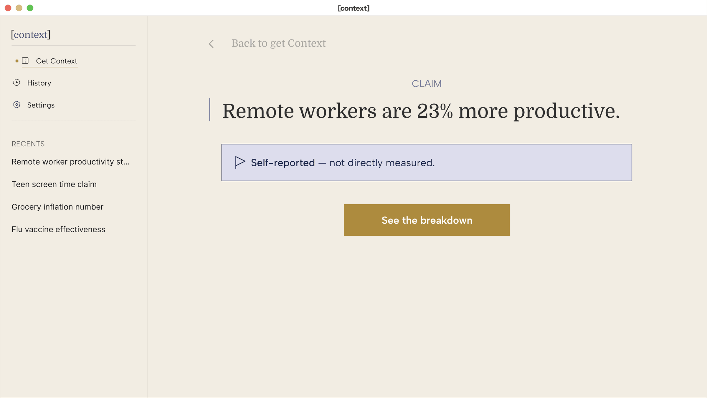
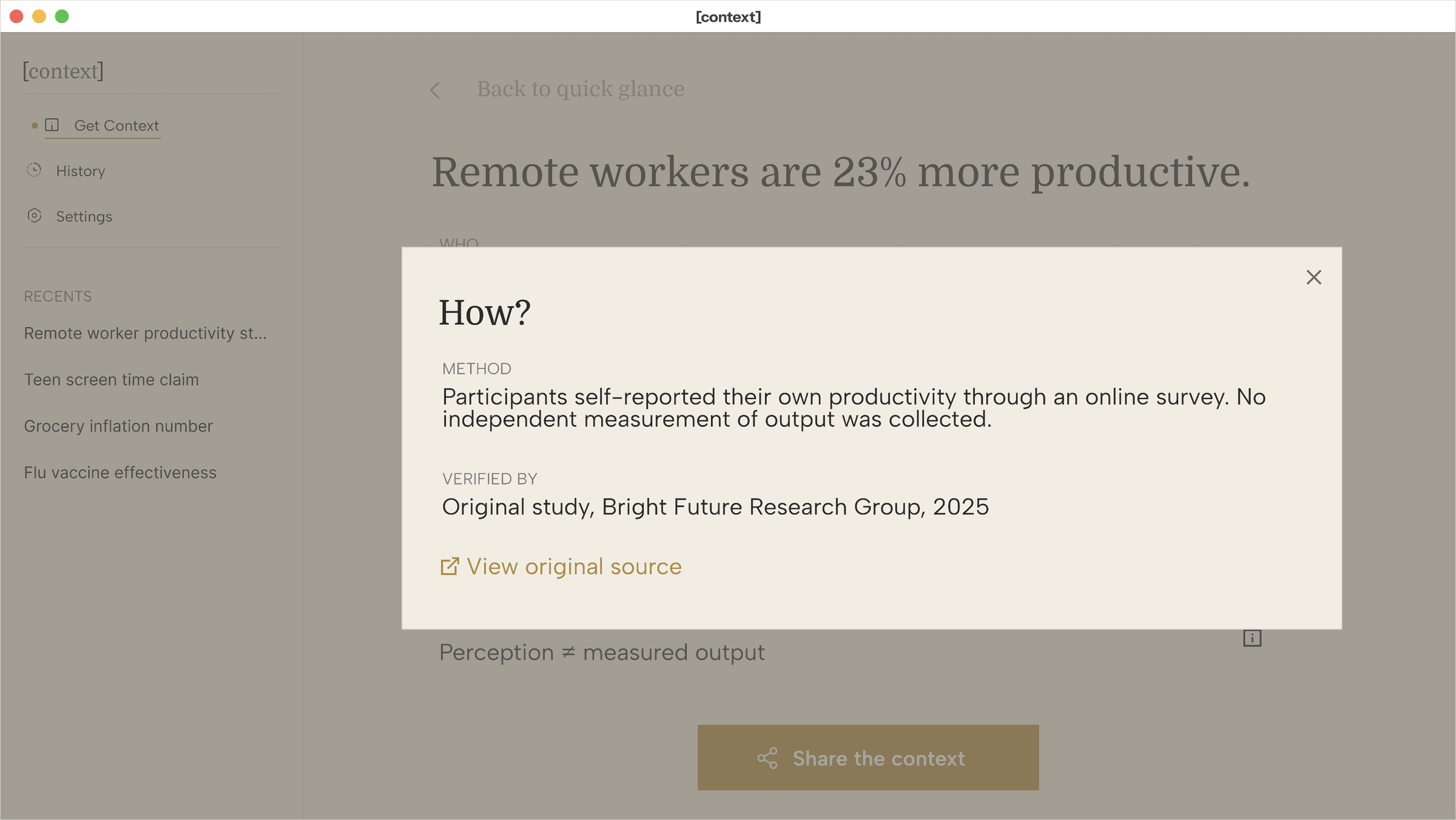
Claims travel faster than the context behind them. [context] is a tool that reveals the missing dimensions of a claim: who was studied, when, how it was measured, what it was compared with, and what it doesn’t tell you, without asking anyone to become a researcher first. Built end-to-end from a single interaction idea through real interviews, a persona, wireframes, and final screens.
So I ran interviews to work from.
Research synthesis
“If it sounds like something I should worry about, I want to know fast whether I actually should.”
Meet Miles


Miles Ferris
The Overwhelmed Sharer
- 44
- School administrator
- Dayton, OH
Bio
Splits his attention between running a small school office and the family and parent group chats that constantly forward him things. Reads news and posts in short bursts on his phone, between tasks, not at a desk with time to dig. Doesn’t think of himself as especially tech-savvy, and is wary of anything that feels like extra homework.
Personality
Miles
User journey map
Miles’s journey across four stages. Tap one to see his tasks, feelings, and where the experience still falls short.
- Sees a claim forwarded into a family group chat.
- Skims it quickly between other tasks on his phone.
- Feels a flicker of doubt about whether to trust it.
Starts distracted and mildly skeptical, with a low-grade worry about being fooled, or fooling someone else by passing it on.
Nothing currently signals that context is even available. The claim looks exactly as credible as everything else in the feed.
A tool built to add clarity, not more noise.
What I built
Mobile
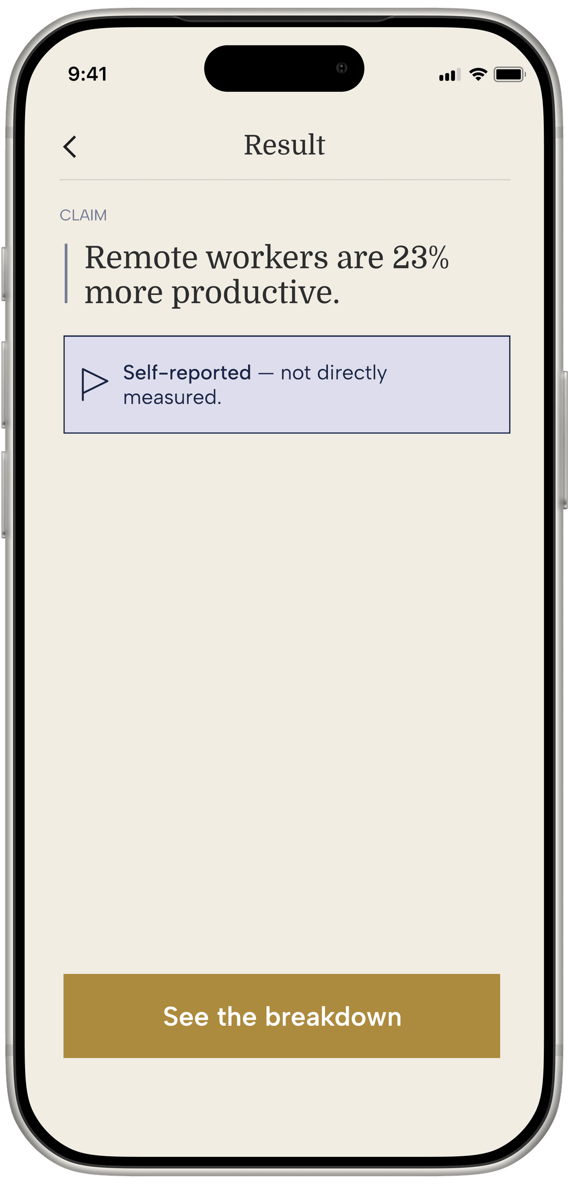
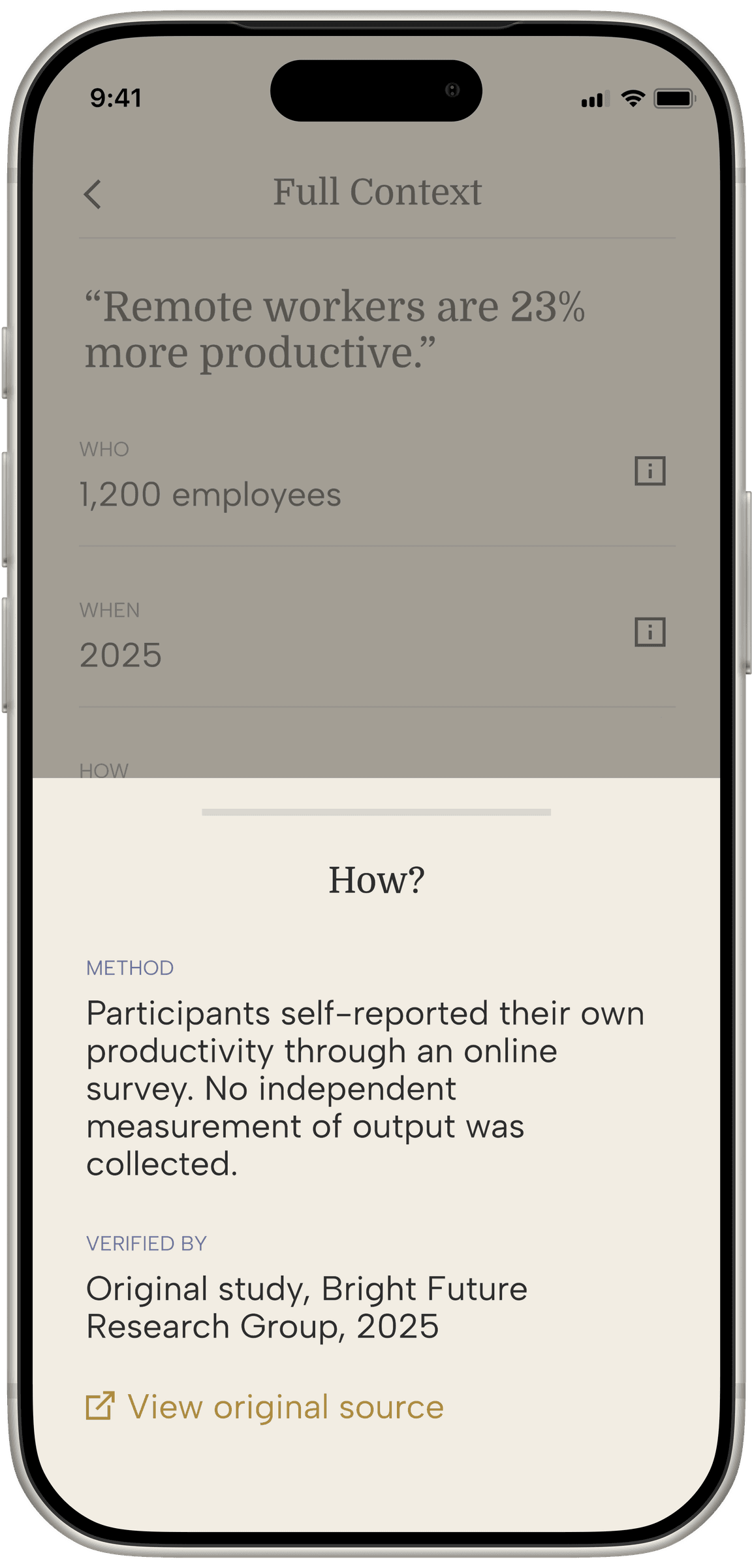
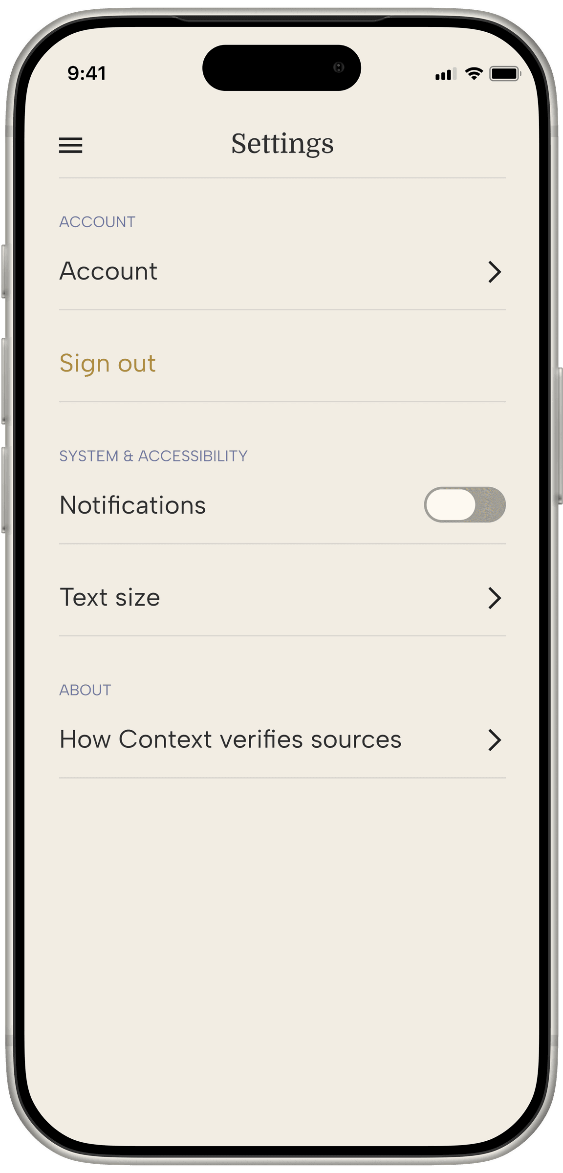
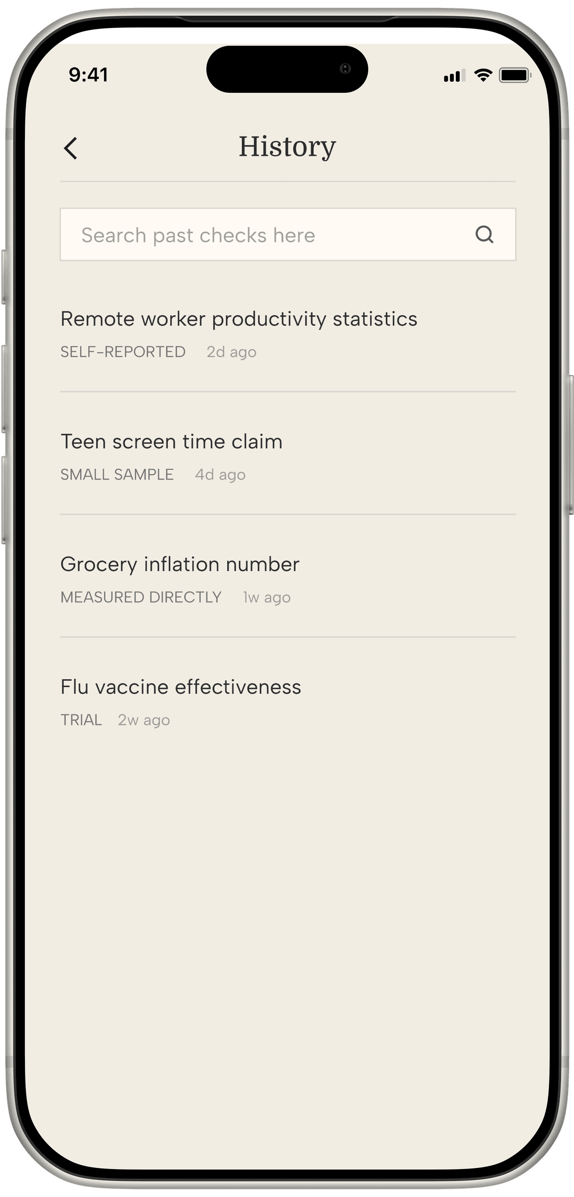
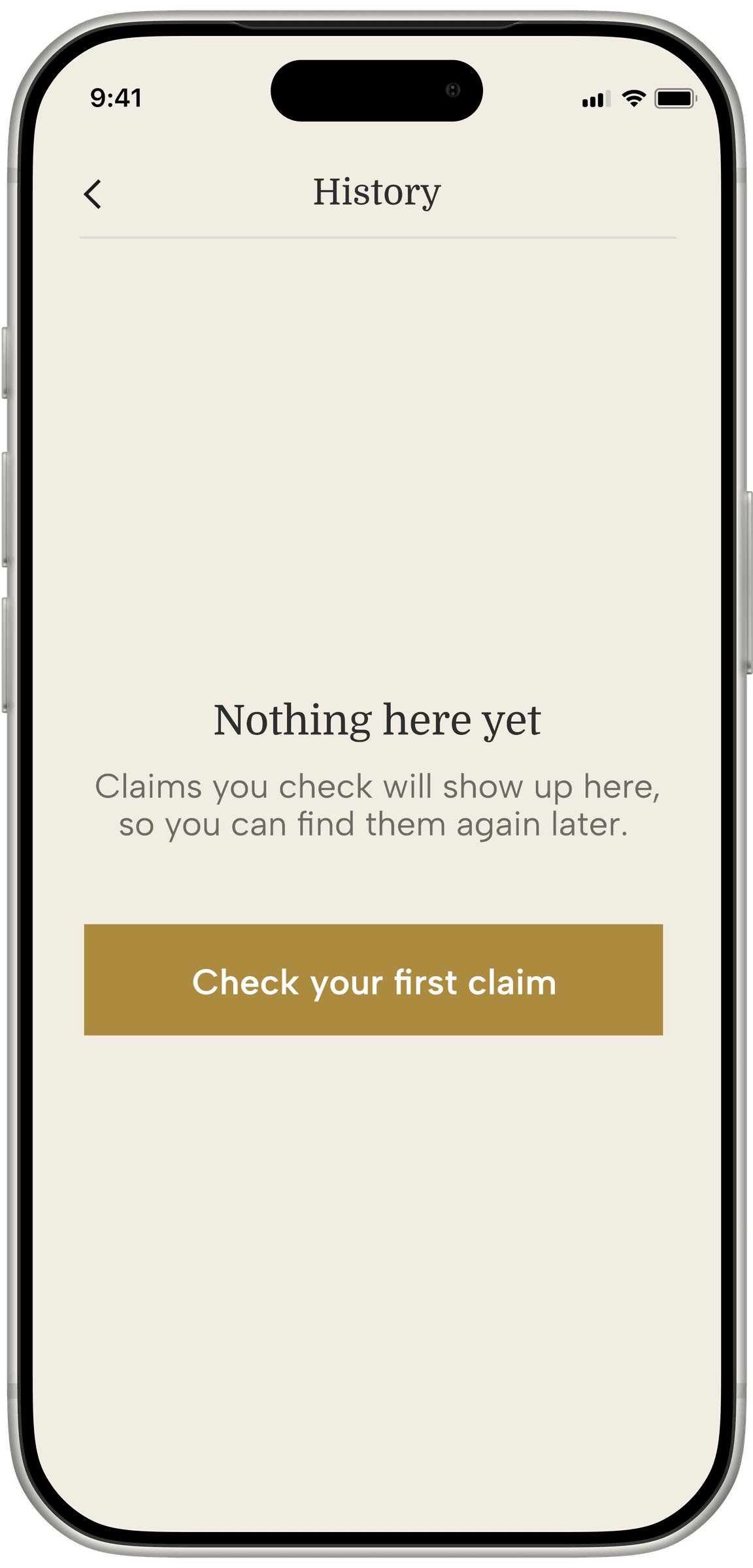
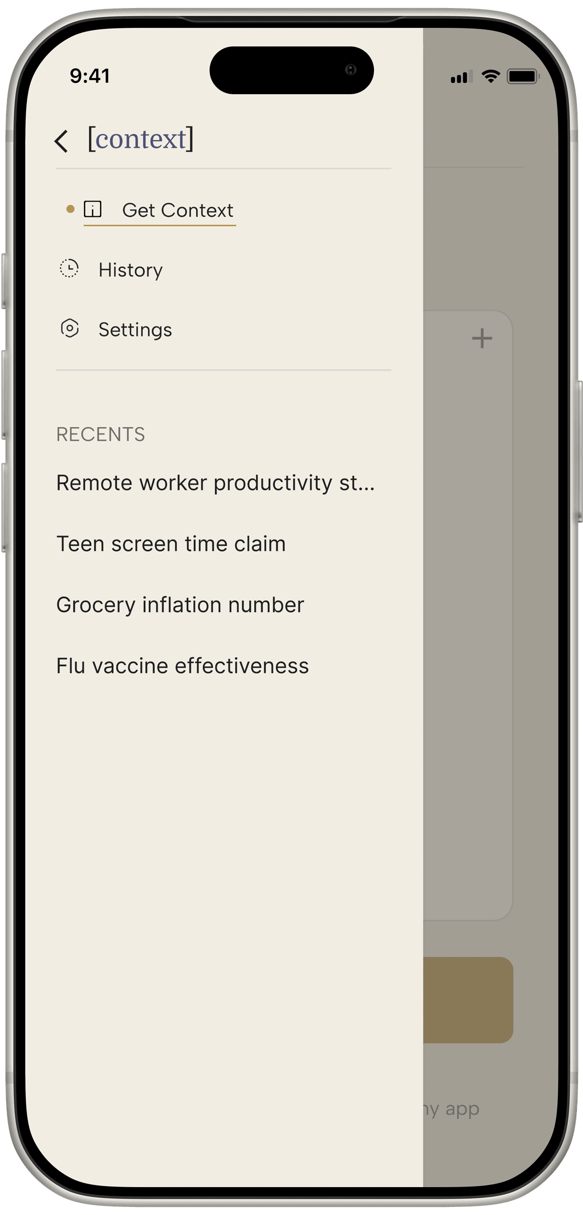
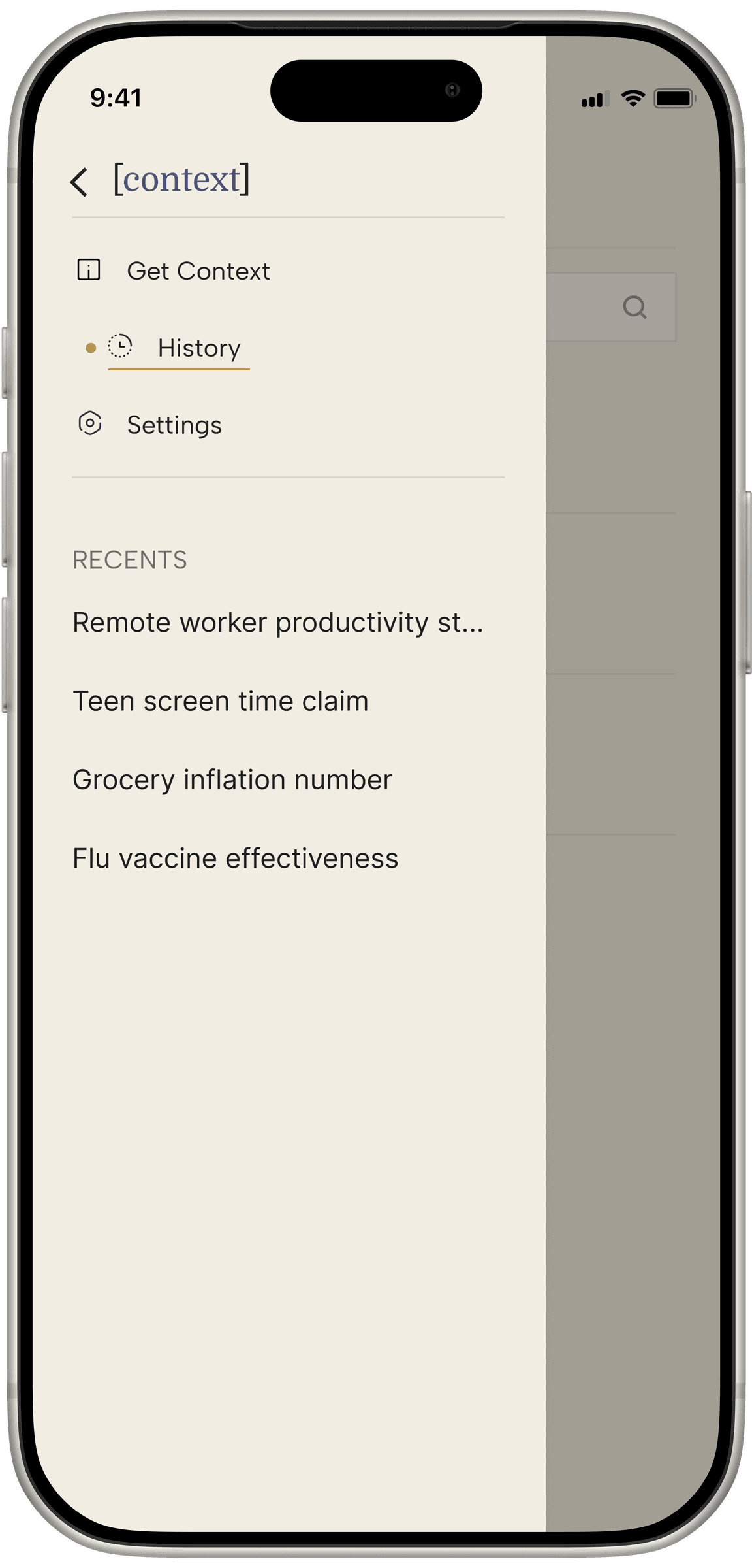
![Context's Full Context screen in a phone frame, with the [C] mark beside it.](/_next/image?url=%2Fwork%2Fcontext%2Fscreens%2Fhighlight.png&w=3840&q=90)
Desktop
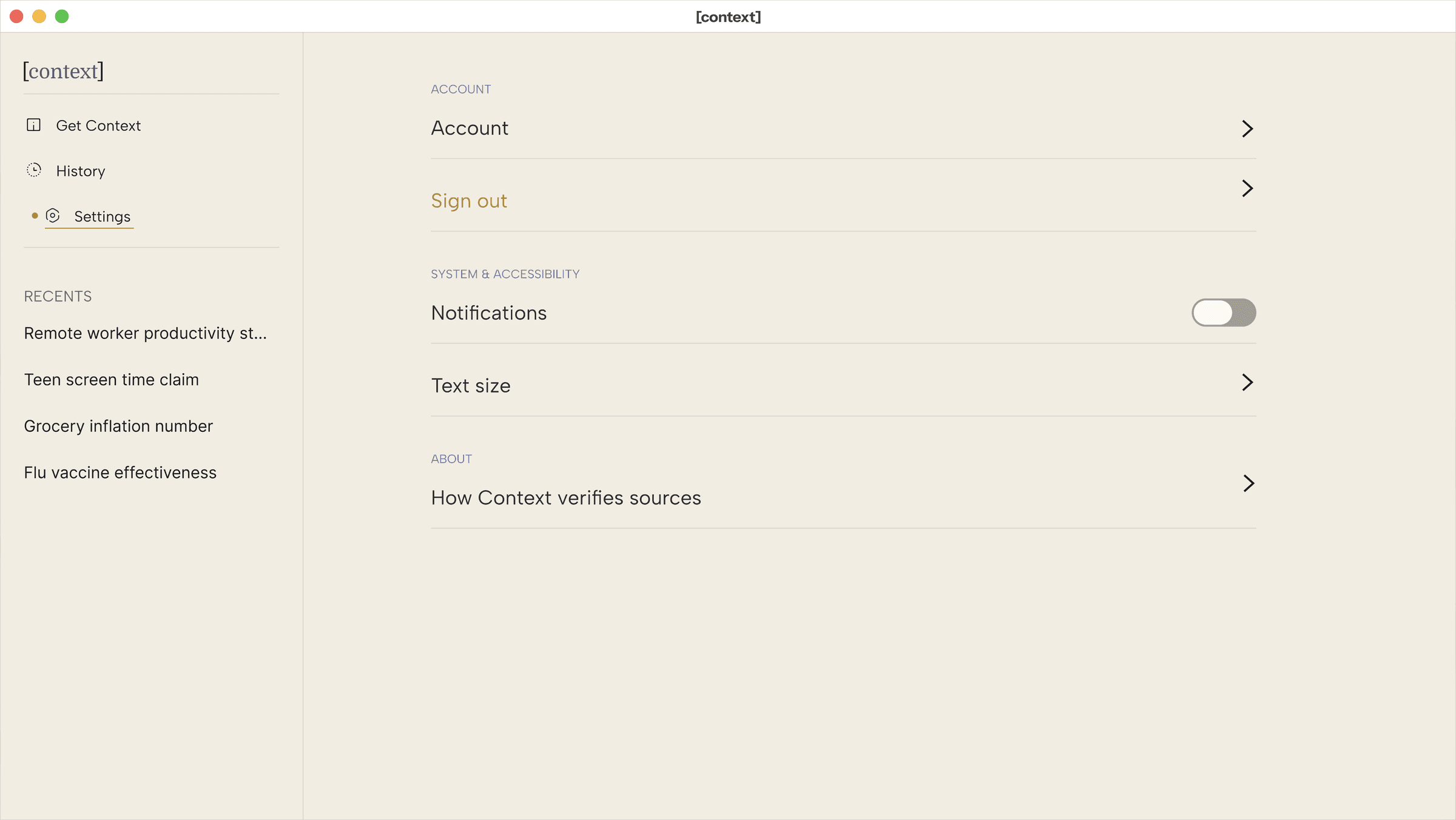
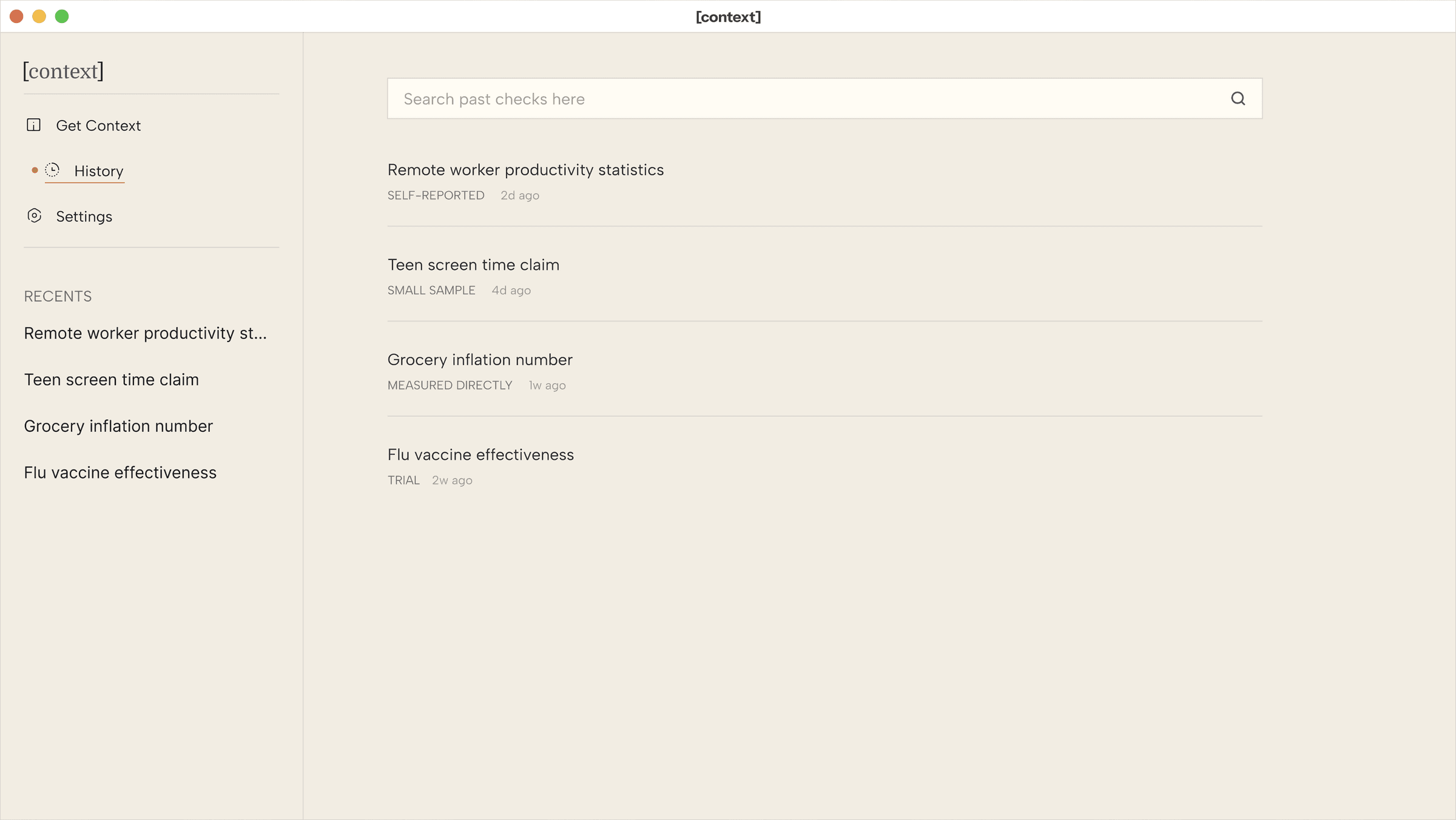
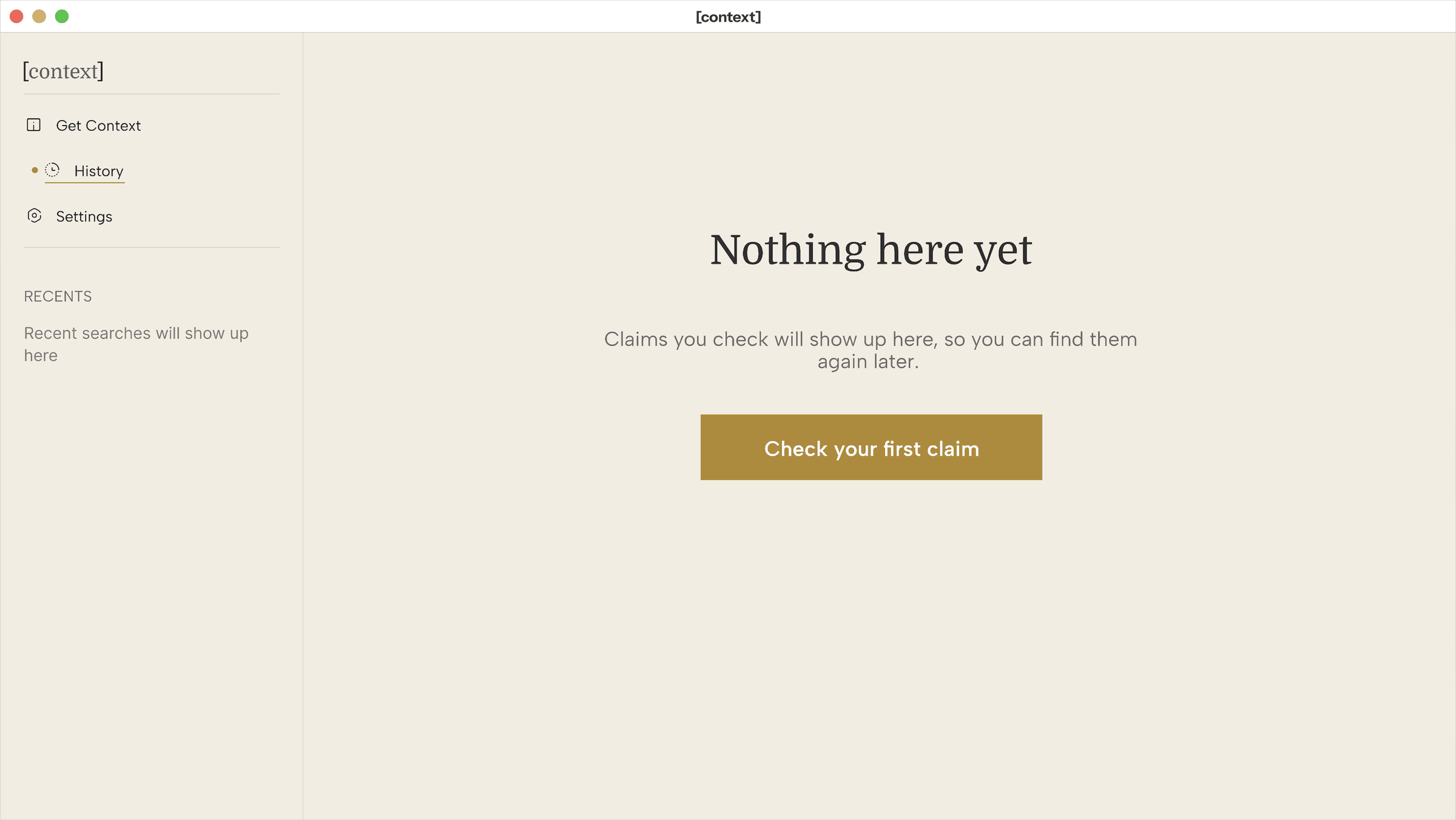
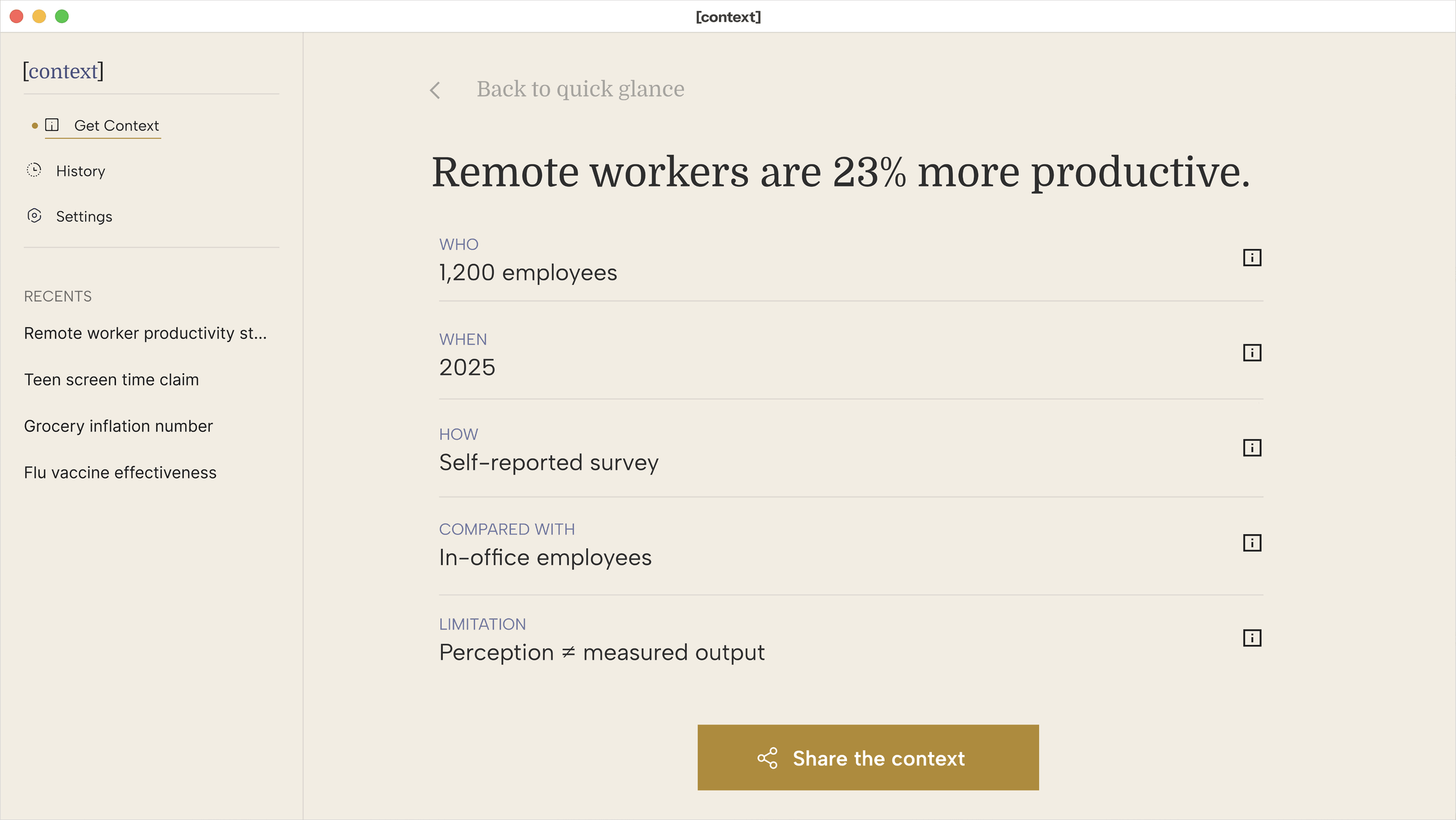
A closer look at the final screens.
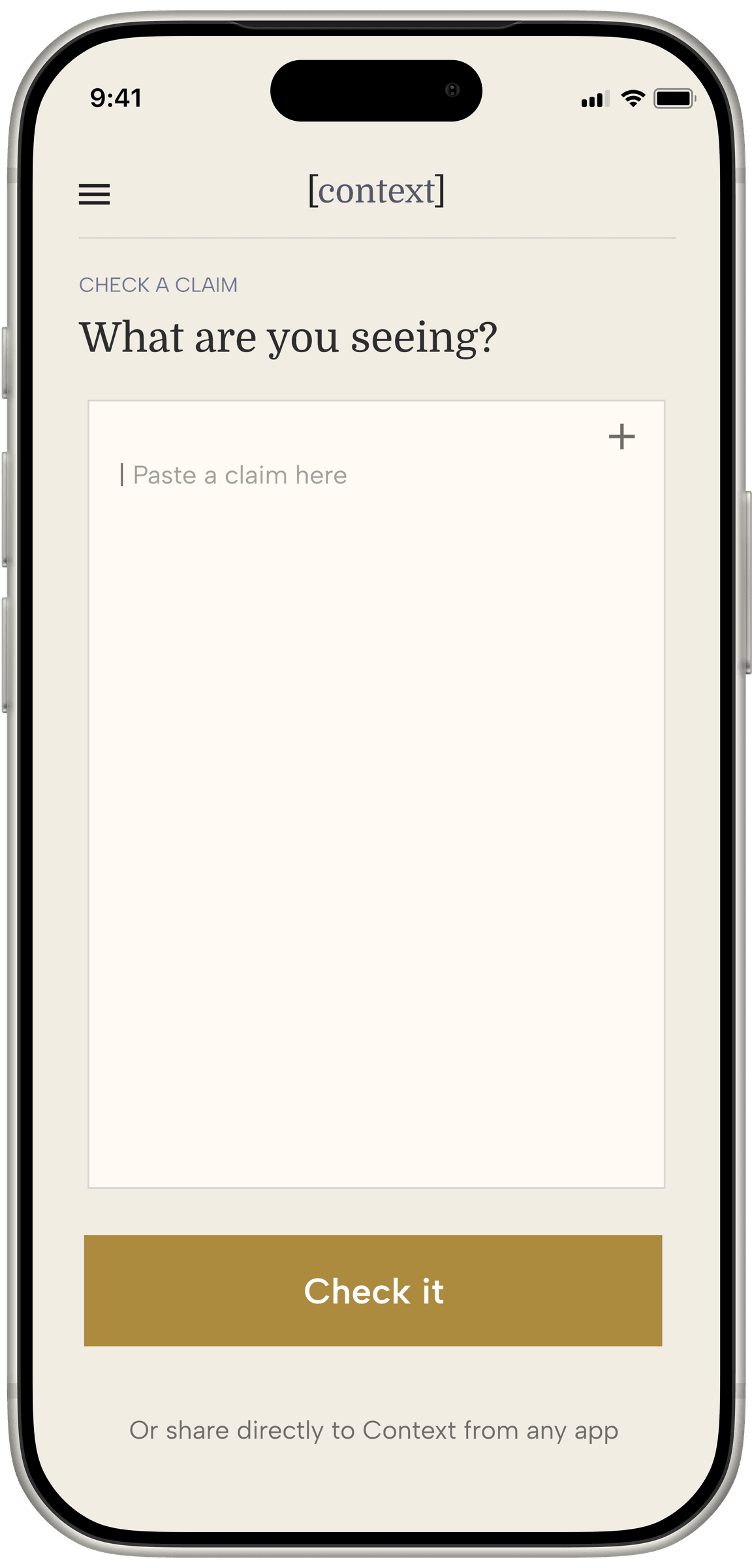
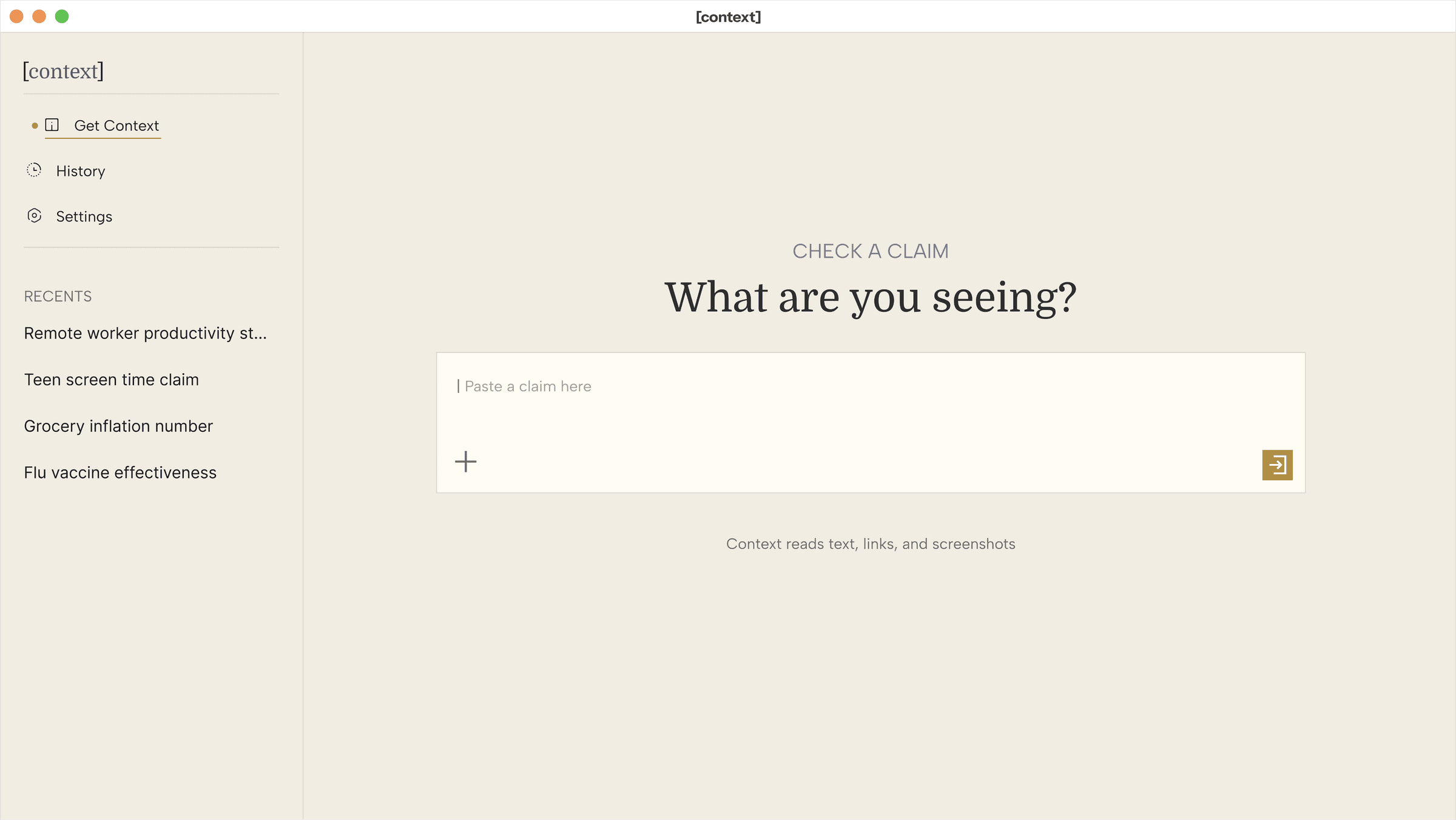
Home
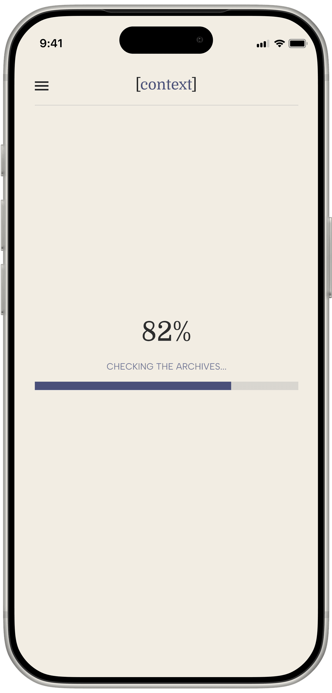
One field, one button. Nothing else competes for the first tap.
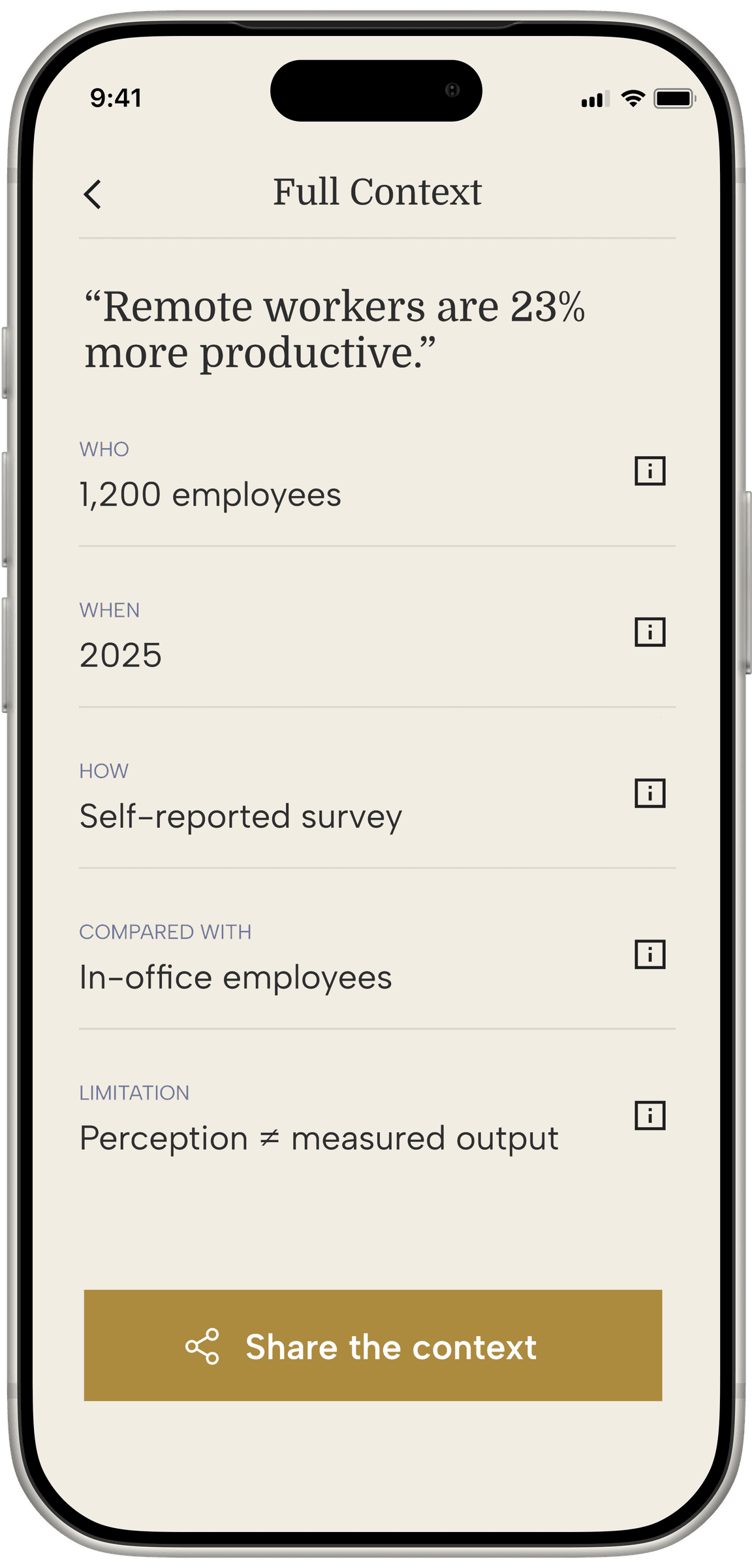
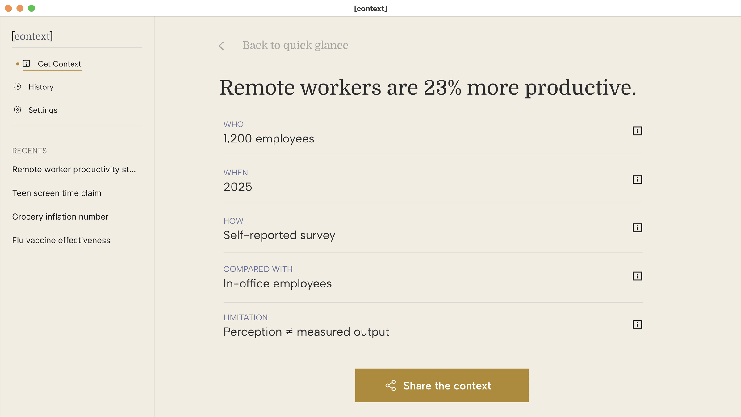
Breakdown
Five categories, spelled out in full: Compared With and Limitation, never abbreviated.
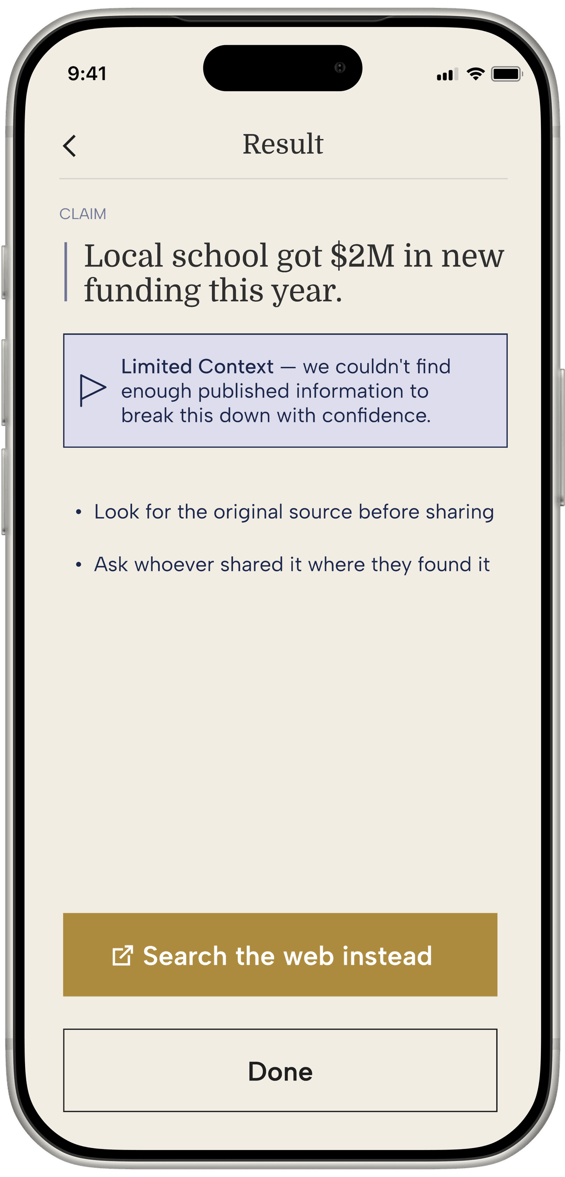
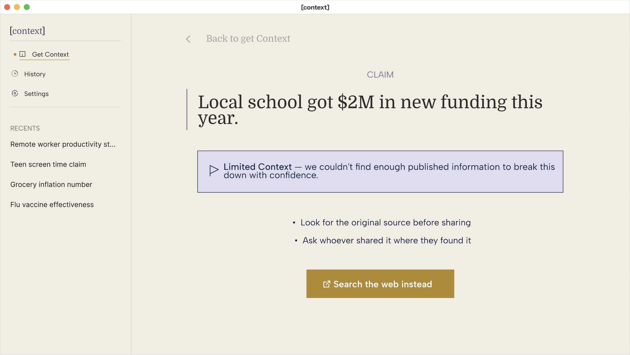
Limited Context
Honesty about its own limits, styled the same as any other result, not as an error.
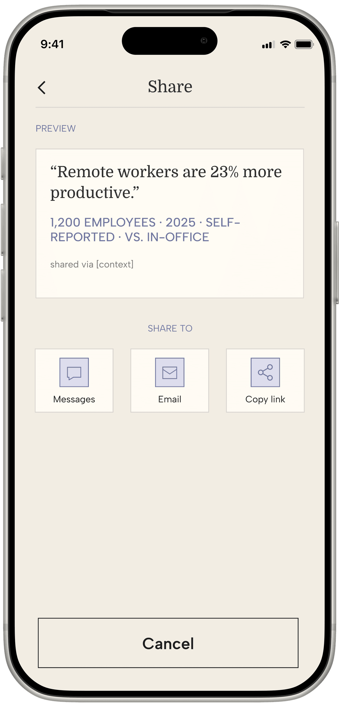
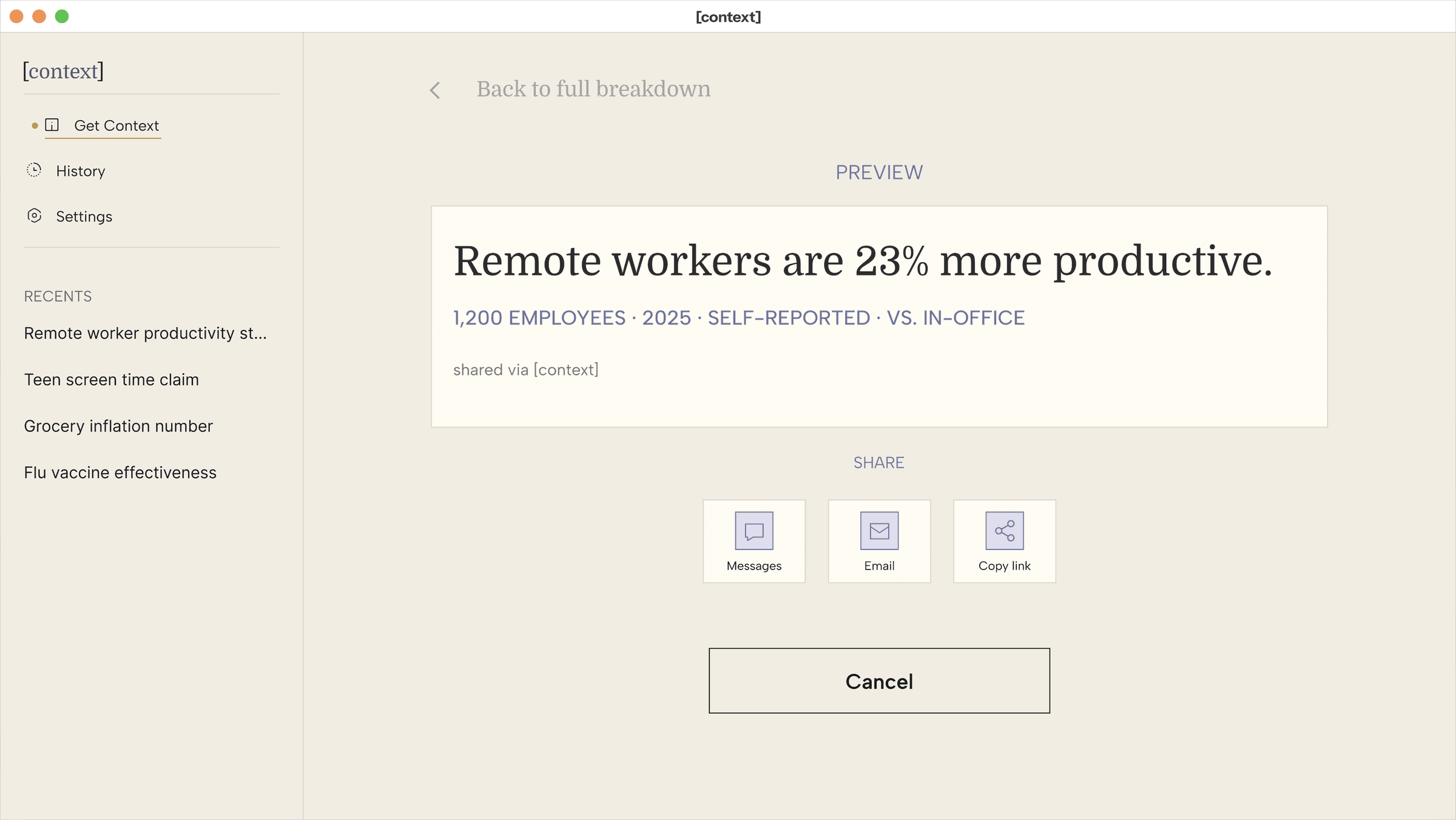
Share
Every share carries the context with it, never just the bare claim.
Every decision tied back to something in Miles’s research.
What worked
Treating every UI decision as answering one question: does this help someone interpret a claim, or work against it.
What I'd do differently
Surface who verifies Context's own information earlier — right now that only shows up once someone's already deep into a result.
What I'd track
How often someone opens the full breakdown versus stopping at the flag, and whether a “limited context” result changes what people do with a claim at all.